WWDC25 is long since over and, as per recent years, UIKit is far from the star of the show. What was once the new and shiny thing is no longer, but that’s not to say it didn't receive plenty of new and shiny additions. In fact, that couldn't be further from the truth!
As always, Apple have done a good job of documenting the big changes to UIKit. This year’s What’s New in UIKit session is well worth tuning in to! However, there's only so much you can fit into an easily digestible dub dub session and, at the time of writing, even Apple's UIKit updates article barely scratches the surface of this year's changes!
So, for my fellow UIKit-enjoyers out there, here's my first (and maybe annual?) comprehensive list of changes to UIKit in iOS 19 26...
UIAccessibility 26.1
In iOS 26.1, UIAccessibility's buttonShapesEnabled property has been deprecated in favour of a new property of AccessibilitySettings, showBordersEnabled.
static var showBordersEnabled :Bool {get }
Along with that, UIAccessibility's static buttonShapesEnabledStatusDidChangeNotification property has also been deprecated in favour of AccessibilitySettings' new showBordersEnabledStatusDidChangeNotification constant.
static let showBordersEnabledStatusDidChangeNotification :NSNotification .Name
For now, both of these deprecations are soft-deprecations, meaning Xcode will shout at you but your code will still compile.
UIAction
Identifier
UIAction, specifically UIAction.Identifier, has received a small quality of life change with a new constant, newFromPasteboard.
static let newFromPasteboard :UIAction .Identifier
This joins the small handful of predefined action identifiers available for common system tasks: paste, pasteAndGo, pasteAndMatchStyle and pasteAndSearch. As creating a new document from the current contents of the pasteboard is an increasingly popular UX paradigm, it's a welcome addition.
UIApplicationDelegate
In the run-up to WWDC, there were rumours circulating online about a potential UIApplicationDelegate deprecation, stemming from a blog post highlighting some interesting code committed to Apple's open-source WebKit repo.
The assumption was that developers would have to move towards the SwiftUI app lifecycle, backed by a class called SwiftUI.AppDelegate that conformed to the UIApplicationDelegate protocol.
Given a moment of critical thinking, you might have arrived at the more sensible conclusion that Apple might be deprecating a small handful of UIApplicationDelegate's methods in favour of their modern UISceneDelegate and UIWindowSceneDelegate equivalents...
Anyway, Apple have deprecated a handful of UIApplicationDelegate's method in favour of their modern UISceneDelegate and UIWindowSceneDelegate equivalents!
| UIApplicationDelegate Deprecation | UISceneDelegate Equivalent |
|---|---|
| applicationDidBecomeActive(_:) | sceneDidBecomeActive(_:) |
| applicationWillResignActive(_:) | sceneWillResignActive(_:) |
| applicationDidEnterBackground(_:) | sceneDidEnterBackground(_:) |
| applicationWillEnterForeground(_:) | sceneWillEnterForeground(_:) |
| application(_:willContinueUserActivityWithType:) | scene(_:willContinueUserActivityWithType:) |
| application(_:continue:restorationHandler:) | scene(_:continue:) |
| application(_:didUpdate:) | scene(_:didUpdate:) |
| application(_:didFailToContinueUserActivityWithType:error:) | scene(_:didFailToContinueUserActivityWithType:error:) |
| application(_:open:options:) | scene(_:openURLContexts:) |
| UIApplicationDelegate Deprecation | UIWindowSceneDelegate Equivalent |
|---|---|
| application(_:performActionFor:completionHandler:) | windowScene(_:performActionFor:completionHandler:) |
| application(_:userDidAcceptCloudKitShareWith:) | windowScene(_:userDidAcceptCloudKitShareWith:) |
These deprecations shouldn't come as too much of a surprise as Apple have been pushing UISceneDelegate and UIWindowSceneDelegate for a while. With a bit of luck, you've already migrated and can focus your efforts on Liquid Glass-ifying your app instead!
UIBackgroundExtensionView
UIBackgroundExtensionView is a new UIView subclass used for extending your app's rich content, like header images, into a parent view's unsafe areas, such as that below a UISplitViewController' sidebar.
class UIBackgroundExtensionView :UIView {
var contentView :UIView ? {get set }
var automaticallyPlacesContentView :Bool {get set }
}
You provide the background extension view with a contentView, such as a UIImageView, and the background extension view seamlessly extends the content into the unsafe areas without clipping the content itself. It does this with a handful of clever visual effects, such as tiling and flipping your content view and applying a number of subtle blurs.
let imageView =UIImageView ()
imageView.clipsToBounds =true
imageView.contentMode = .scaleAspectFill
imageView.image =UIImage (resource : .iOS26Wallpaper )
let backgroundExtensionView =UIBackgroundExtensionView ()
backgroundExtensionView.contentView = imageView
backgroundExtensionView.translatesAutoresizingMaskIntoConstraints =false
view .addSubview (backgroundExtensionView)
NSLayoutConstraint .activate ([
backgroundExtensionView.topAnchor .constraint (equalTo :view .topAnchor ),
backgroundExtensionView.leadingAnchor .constraint (equalTo :view .leadingAnchor ),
backgroundExtensionView.trailingAnchor .constraint (equalTo :view .trailingAnchor ),
backgroundExtensionView.heightAnchor .constraint (equalTo :view .heightAnchor ,multiplier :0.4 )
])
The background extension view also gives you the option to layout your content view manually by setting its automaticallyPlacesContentView property to false. You can set the content view's position using Auto Layout or by setting its frame.
backgroundExtensionView.automaticallyPlacesContentView =false
See the example below where the top of the image view is constrained to the top of the background extension view rather than to the top of the background extension view's safe area layout guide.
UIBarButtonItem
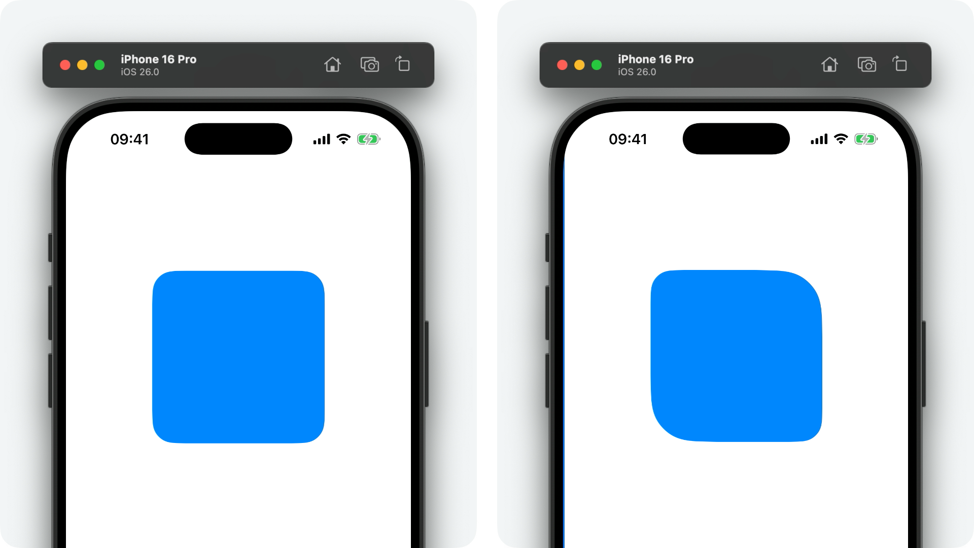
UIBarButtonItem has received a number of nice changes to support their new Liquid Glass appearance, the first being a new property, sharesBackground.
var sharesBackground :Bool {get set }
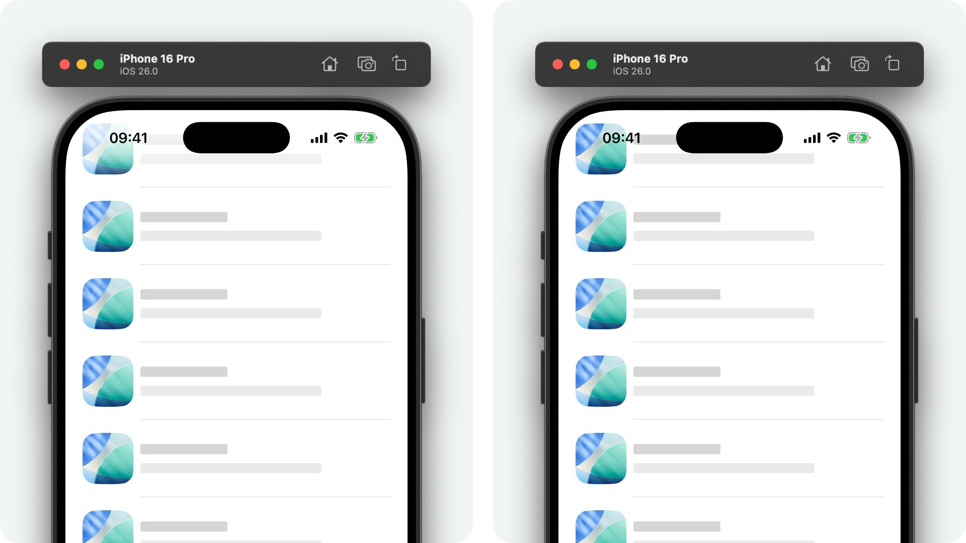
In iOS 26, adjacent bar buttons are grouped with a shared Liquid Glass background. Using this property, you can opt out of this behaviour on a per-button basis. See the examples below where, on the left, the bar buttons share a background and, on the right, they don't.
let plusBarButtonItem =UIBarButtonItem ()
plusBarButtonItem.sharesBackground =false
plusBarButtonItem.image =UIImage (systemName :"plus" )
let minusBarButtonItem =UIBarButtonItem ()
minusBarButtonItem.image =UIImage (systemName :"minus" )
navigationItem .rightBarButtonItems = [plusBarButtonItem, minusBarButtonItem]
It's worth noting that, as per the example above, only one bar button item needs to opt out of the sharesBackground property for the effect to take place.
Alternatively, for the same effect, you can use the new static fixedSpace() convenience method to initialise an empty bar button item with a fixed width of zero.
class func fixedSpace () ->UIBarButtonItem
Just sandwich one of these between your bar button items that you don't want to share a background, and you're good to go!
On the topic of backgrounds, if you have a more custom design system in your app, you might want to opt out of the Liquid Glass background altogether. In which case, the new hidesSharedBackground property is your friend!
var hidesSharedBackground :Bool {get set }
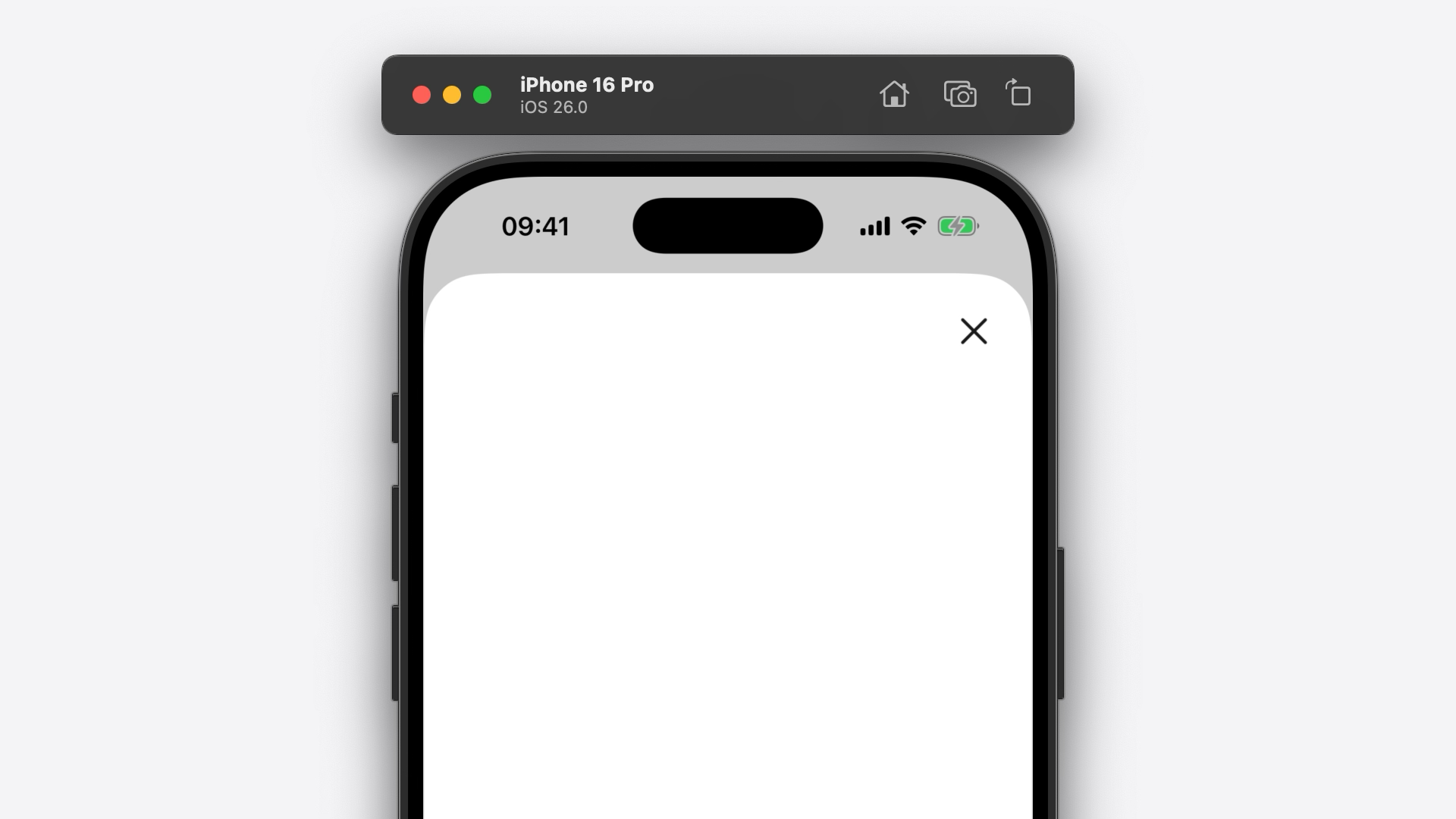
let closeBarButtonItem =UIBarButtonItem ()
closeBarButtonItem.hidesSharedBackground =true
closeBarButtonItem.image =UIImage (systemName :"xmark" )
navigationItem .rightBarButtonItem = closeBarButtonItem
UIBarButtonItem also has a new identifier property that we can customise to influence the new shared transition of bar buttons between navigation bars and toolbars.
var identifier :String ? {get set }
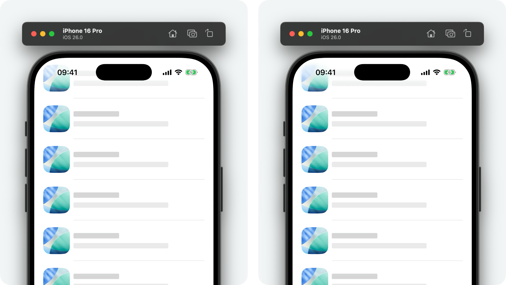
Under the hood, UIKit uses various heuristics to determine if two instances of UIBarButtonItem are "the same" across two screens and, therefore, whether or not they should animate between states. However, it can't always get this right. One such example is when you're using a customView for your bar button. See the example below where two visually identical bar buttons animate across navigation controller transitions.
Setting both bar button items' identifier property to a mutual string fixes this.
let label =UILabel ()
label.text ="Label"
let barButtonItem =UIBarButtonItem (customView : label)
barButtonItem.identifier ="com.example.label-custom-view"
navigationItem .rightBarButtonItem = barButtonItem
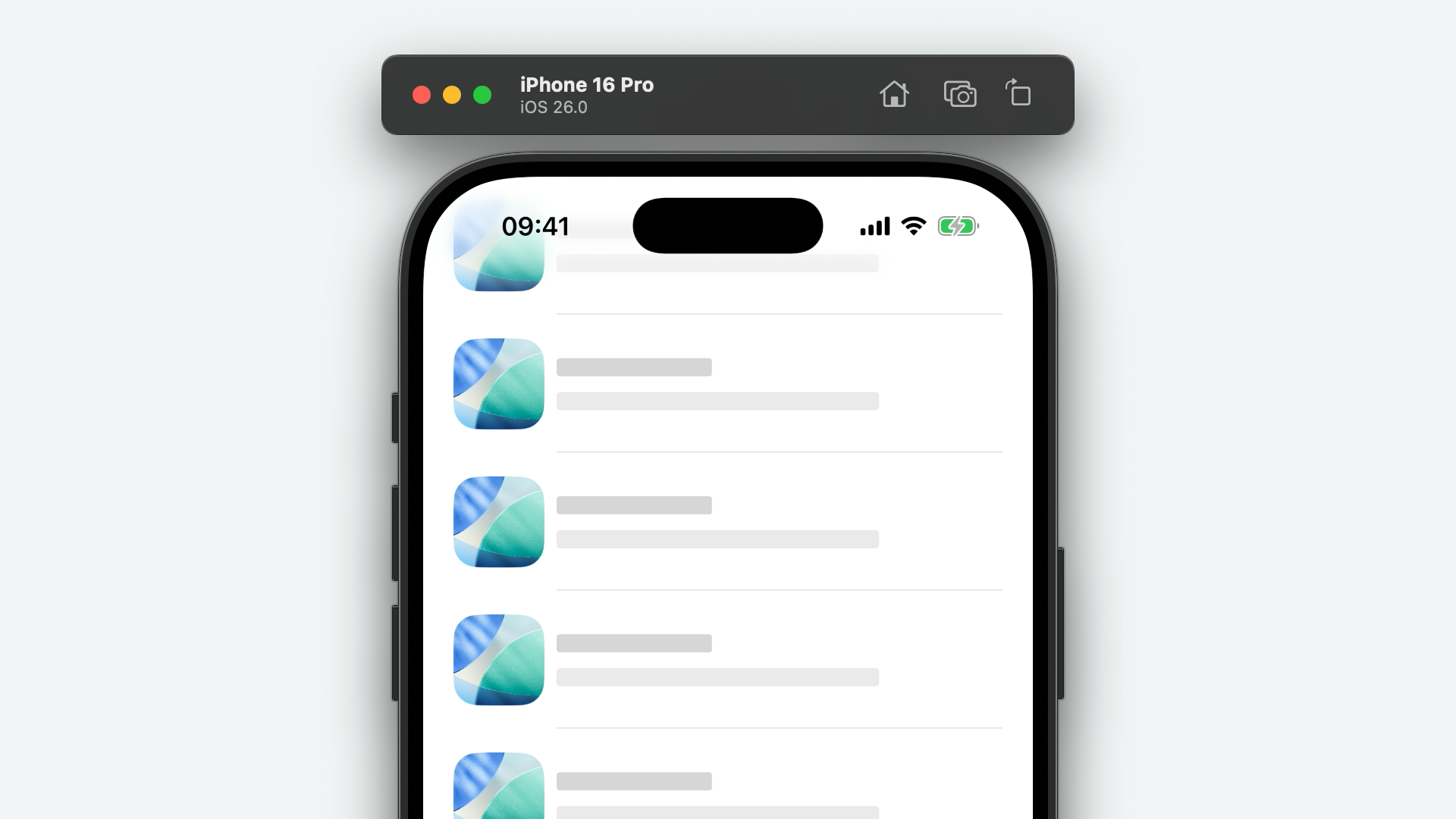
Finally, UIBarButtonItem has a new badge property.
var badge :UIBarButtonItem .Badge ? {get set }
This property serves to provide similar functionality to UITabBarItem's badgeValue property, but is far more customisable, allowing us to customise not only the badge value, but also the font, foreground colour, and background colour!
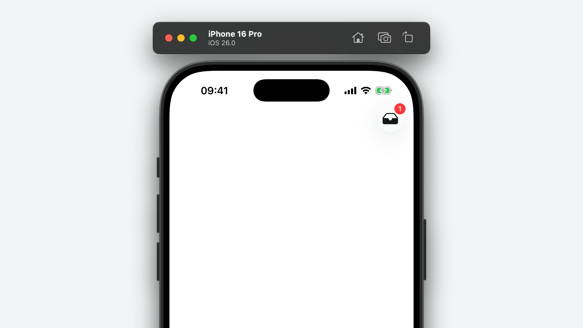
It's worth noting that, at the time of writing, bar button badges are only supported in navigation bars - not tool bars.
Badge
The new UIBarButtonItem.Badge structure is a really nice new API for describing the appearance of a bar button item's badge value. It's incredibly flexible, far more so than UITabBarItem's equivalent API.
extension UIBarButtonItem {
struct Badge :Equatable {
var foregroundColor :UIColor ? {get set }
var backgroundColor :UIColor ? {get set }
var stringValue :String ? {get }
var font :UIFont ? {get set }
static func count (_ count:Int ) ->UIBarButtonItem .Badge
static func string (_ string:String ) ->UIBarButtonItem .Badge
static func indicator () ->UIBarButtonItem .Badge
}
}
You don't initialise an instance of the new Badge struct yourself. Instead, you can use one of the convenient static methods such as count(_:), string(_:) or indicator().
Once created, you can customise the font, foregroundColor and backgroundColor properties as needed.
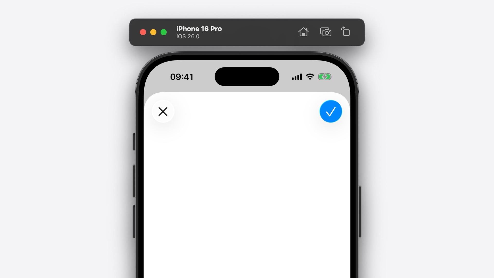
Style
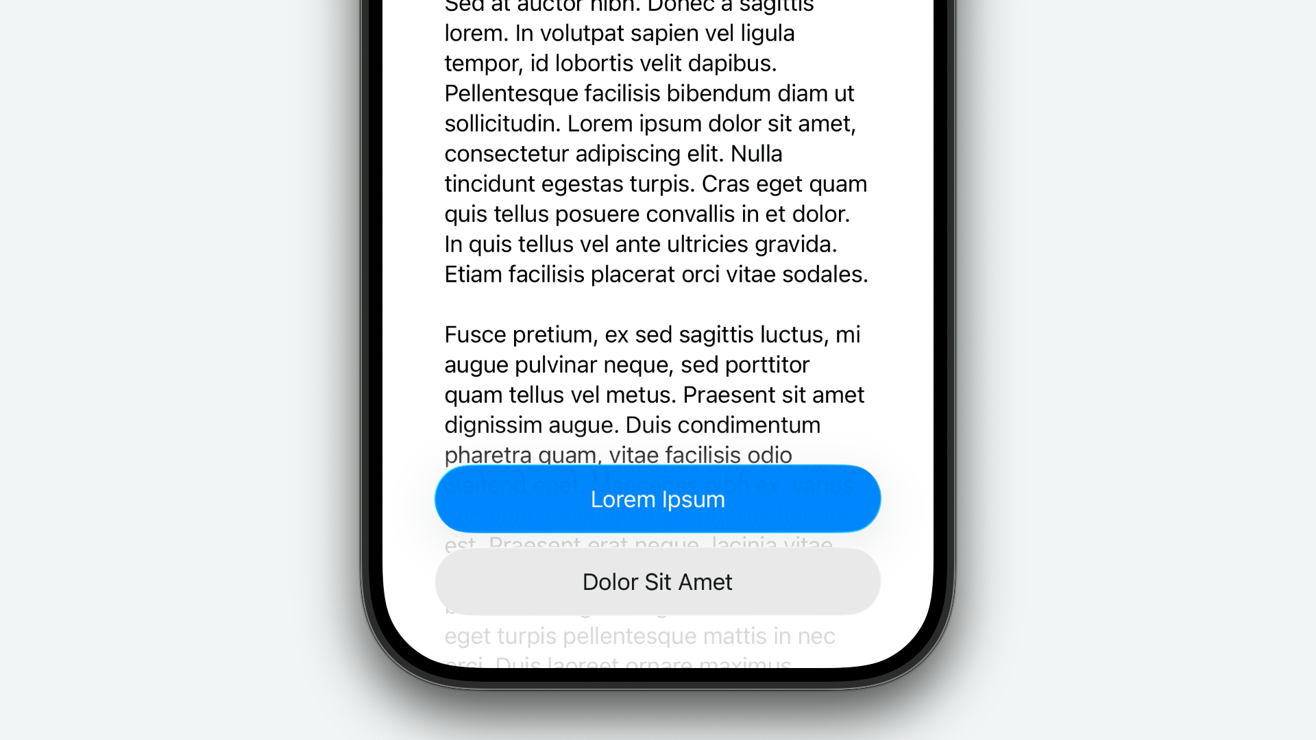
UIBarButtonItem.Style has been updated with a new prominent case, resulting in a bar button with a more eye-catching appearance, tinted with your app's accent colour by default.
case prominent
This serves as a replacement to the old done case which has been deprecated in iOS 26.
let doneBarButtonItem =UIBarButtonItem ()
doneBarButtonItem.style = .prominent
doneBarButtonItem.image =UIImage (systemName :"checkmark" )
navigationItem .rightBarButtonItem = doneBarButtonItem
SystemItem
The UIBarButtonItem.SystemItem enumeration has received a new writingTools case.
case writingTools
This new system item allows us to add a Writing Tools bar button in navigation bars or tools bars, without having to use private or custom SF Symbols!
UIBarButtonItemGroup
UIBarButtonItemGroup has been updated with a convenient way of initialising a new group with a single, empty bar button item of a fixed width of zero, via the new fixedSpace() class function.
class func fixedSpace () ->UIBarButtonItemGroup
This serves the same purpose as the method under the same of UIBarButtonItem, to visually separate bar buttons. There's no special going on under the hood. In fact, it's just shorthand for...
let barButtonItems: [UIBarButtonItem ] = [.fixedSpace ()]
let group =UIBarButtonItemGroup (barButtonItems : barButtonItems,representativeItem :nil )
UIButton
Configuration
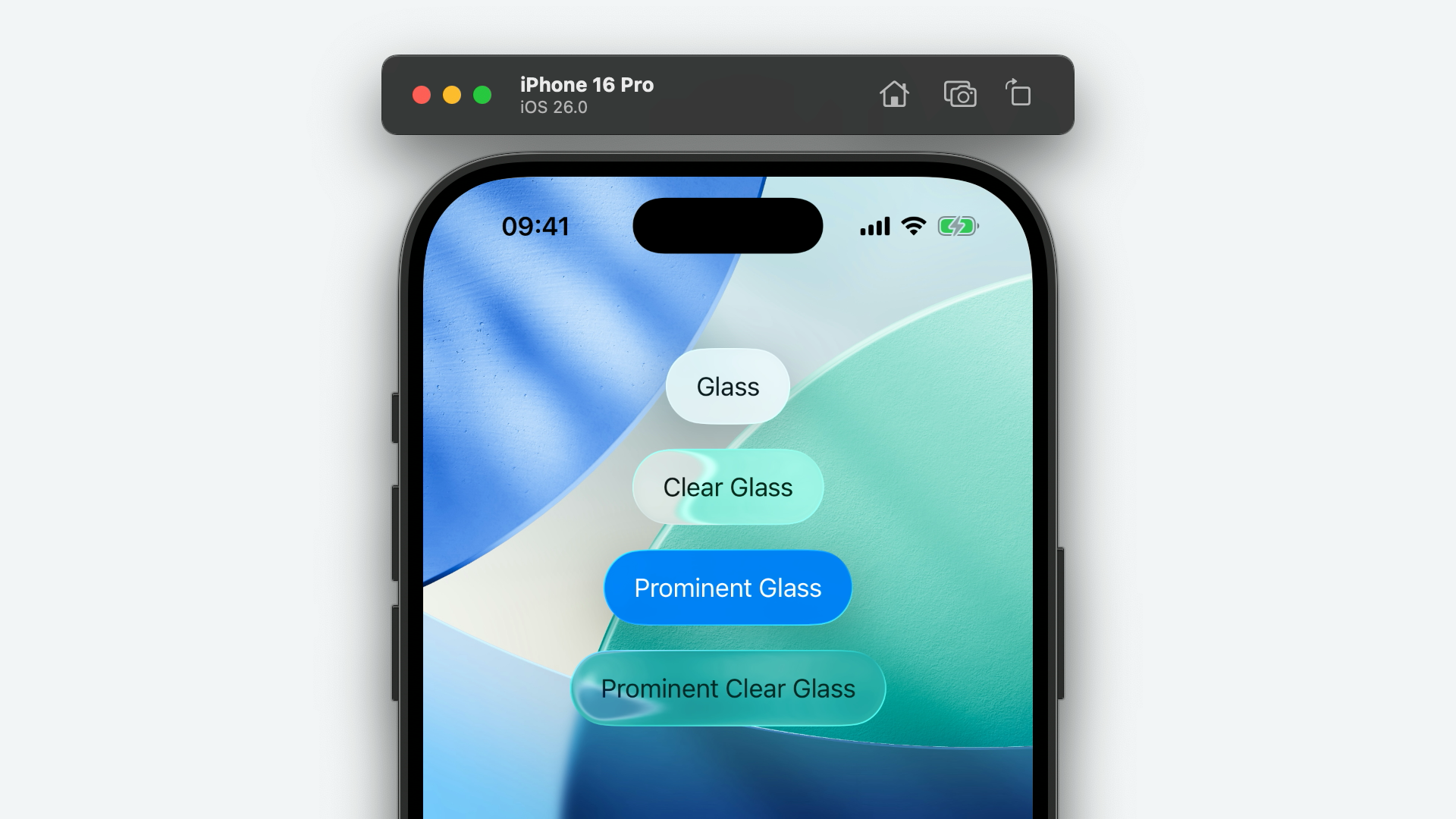
UIButton.Configuration has received several small but important additions this year. The first being several new, static methods for creating Liquid Glass buttons: glass(), clearGlass() prominentGlass() and prominentClearGlass().
extension UIButton {
struct Configuration :Hashable {
static func glass () ->UIButton .Configuration
static func clearGlass () ->UIButton .Configuration
static func prominentGlass () ->UIButton .Configuration
static func prominentClearGlass () ->UIButton .Configuration
}
}
let button =UIButton ()
button.configuration = .glass ()
button.configuration ?.title ="Glass"
The second update to UIButton.Configuration will have you wondering, "Why wasn't this added years ago?" Apple have finally added a symbolContentTransition property!
var symbolContentTransition :UISymbolContentTransition ? {get set }
The value of this property should be an instance of the new UISymbolContentTransition class.
let button =UIButton ()
button.configuration = .prominentGlass ()
button.configuration ?.symbolContentTransition =UISymbolContentTransition (.replace)
The symbol content transition will take place automatically whenever you set the button configuration's image property.
UIColor
It's been a long time coming, what with Apple's displays supporting HDR for many years, but UIColor has finally been updated with initialisers to construct HDR colours!
Firstly, init(red:green:blue:alpha:exposure:).
init (red :CGFloat ,green :CGFloat ,blue :CGFloat ,alpha :CGFloat ,exposure :CGFloat )
Simply call this initialiser, passing in the red, green, blue, and alpha values as normal, but also provide an exposure value. UIKit multiplies this value to the power of 2, meaning an exposure value of 1 makes the colour twice as bright as the SDR's peak white.
Secondly, init(red:green:blue:alpha:linearExposure:).
init (red :CGFloat ,green :CGFloat ,blue :CGFloat ,alpha :CGFloat ,linearExposure :CGFloat )
Much like its (non-linear) exposure counterpart, call this initialiser as you would normally, with RGBA values, this time passing in a linearExposure value. UIKit doesn't do anything under the hood to compute the brightness here, so a value of 1 would result in a colour one times the brightness of the SDR's peak white, and a value of 2 would result in a colour two times as bright.
To get the exposure of an HDR colour after the fact, use the new linearExposure property.
var linearExposure :CGFloat {get }
A new property of UIColor, standardDynamicRange, will return an instance of the same UIColor but in the SDR colour space.
var standardDynamicRange :UIColor {get }
Finally, on the UIColor-front, there's a new applyingContentHeadroom(_:) method. This method changes how bright the colour is perceived in HDR by applying a new content headroom (how much "extra brightness" the colour has above the SDR's peak white).
func applyingContentHeadroom (_ contentHeadroom:CGFloat ) ->UIColor
It's worth noting that the colour returned by this method maintains the original colour's RGBA components.
UIColorEffect 26.1
Historically, UIColorEffect was a private UIKit class that had been kicking around since iOS 12. However, as of the iOS 26.1 SDK, (some of) it is publicly available.
@available (iOS11.0 , *)
class UIColorEffect :UIVisualEffect {
@available (iOS26.1 , *)
convenience init (color :UIColor ?)
}
I've included the @available annotations in the code above because the availability of this class and its initialiser is a little confusing.
The class itself back-deploys to iOS 11. This is odd as the first instance I could find of it was in iOS 12... However, the init(color:) initialiser is explicitly marked as being available on iOS 26.1 and above.
So why make it public now? I believe the reason is twofold. The first being to support building custom Liquid Glass controls. By exposing UIColorEffect, we can animate a UIVisualEffectView's effect between a solid colour and glass effect — just like system controls such as UISwitch do.
UIView .animate (springDuration :0.5 ) {
if isExpanded {
thumbView .effect =UIGlassEffect (style : .clear )
}else {
thumbView .effect =UIColorEffect (color : .white )
}
}
The second reason is to support UIPresentationController's new backgroundEffect property also added in the 26.1 SDK. You can read all about that change further down the page.
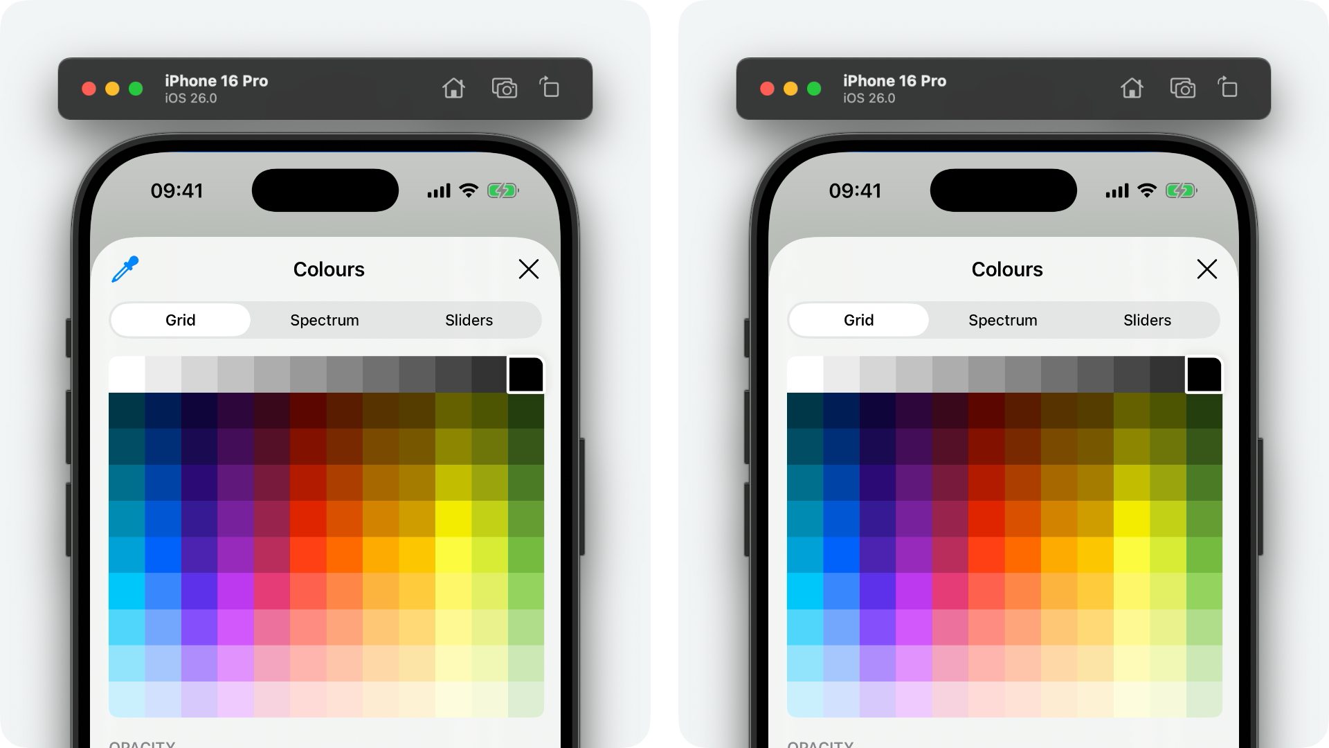
UIColorPickerViewController
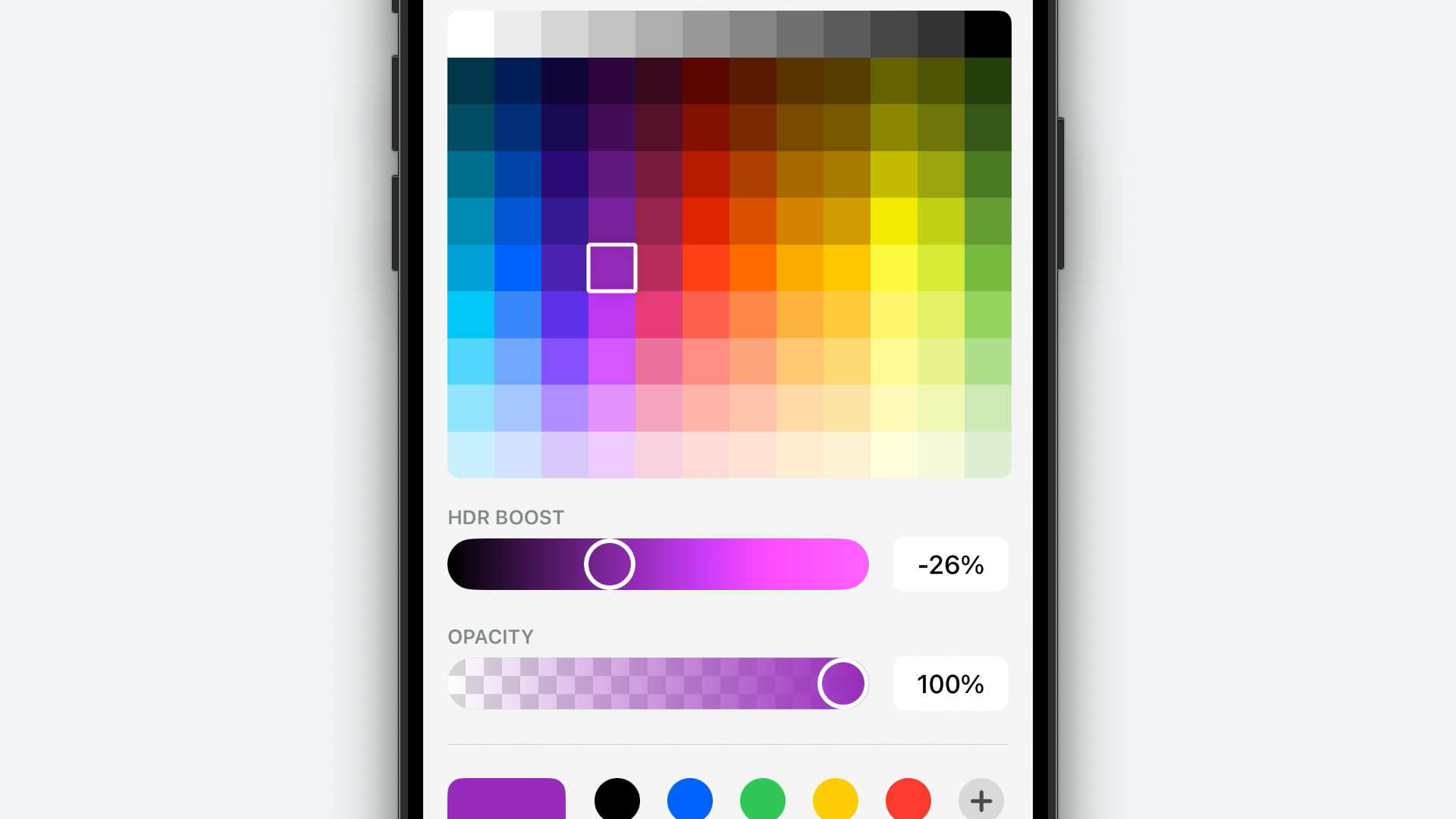
On the topic of colours, UIColorPickerViewController has been updated with a new maximumLinearExposure property to support HDR colours.
var maximumLinearExposure :CGFloat {get set }
Setting this property to a value of anything greater than 1 will surface a new HDR Boost slider to the user for them to customise the exposure of the selected colour.
There's also a new-ish property of UIColorPickerViewController that's been added this year, supportsEyedropper. I say "new-ish" as this was added in iOS 18 as private API but, in iOS 26, is exposed to us mere mortals!
var supportsEyedropper :Bool {get set }
This is another one of those "you see what you get" APIs. Setting this property to false disables the colour picker's eyedropper tool, removing the button from the top, leading edge of the UI.
The default value of this property is true.
UIColorWell
UIColorWell has also received the same treatment as UIColorPickerViewController. Firstly, with a new maximumLinearExposure property.
var maximumLinearExposure :CGFloat {get set }
And secondly, with a supportsEyedropper property.
var supportsEyedropper :Bool {get set }
Because UIColorWell presents a UIColorPickerViewController, the result of these APIs is identical to that of colour picker view controller's equivalents, documented above.
UICornerConfiguration
This is one I'm incredibly excited about - UICornerConfiguration is a new structure, added to support UIView's new cornerConfiguration API, representing the corner radii of a view.
struct UICornerConfiguration :Equatable ,Hashable ,CustomStringConvertible {
static func corners (radius :UICornerRadius ) ->UICornerConfiguration
static func corners (topLeftRadius :UICornerRadius ?,topRightRadius :UICornerRadius ?,bottomLeftRadius :UICornerRadius ?,bottomRightRadius :UICornerRadius ?) ->UICornerConfiguration
static func capsule (maximumRadius :Double ? =nil ) ->UICornerConfiguration
static func uniformCorners (radius :UICornerRadius ) ->UICornerConfiguration
static func uniformEdges (topRadius :UICornerRadius ,bottomRadius :UICornerRadius ) ->UICornerConfiguration
static func uniformEdges (leftRadius :UICornerRadius ,rightRadius :UICornerRadius ) ->UICornerConfiguration
static func uniformTopRadius (_ topRadius:UICornerRadius ,bottomLeftRadius :UICornerRadius ? =nil ,bottomRightRadius :UICornerRadius ? =nil ) ->UICornerConfiguration
static func uniformBottomRadius (_ bottomRadius:UICornerRadius ,topLeftRadius :UICornerRadius ? =nil ,topRightRadius :UICornerRadius ? =nil ) ->UICornerConfiguration
static func uniformLeftRadius (_ leftRadius:UICornerRadius ,topRightRadius :UICornerRadius ? =nil ,bottomRightRadius :UICornerRadius ? =nil ) ->UICornerConfiguration
static func uniformRightRadius (_ rightRadius:UICornerRadius ,topLeftRadius :UICornerRadius ? =nil ,bottomLeftRadius :UICornerRadius ? =nil ) ->UICornerConfiguration
}
It might not sound exciting at first, but it unlocks a host of possibilities that were previously a bit of a ball-ache with UIKit! Let's go over a few of these configurations...
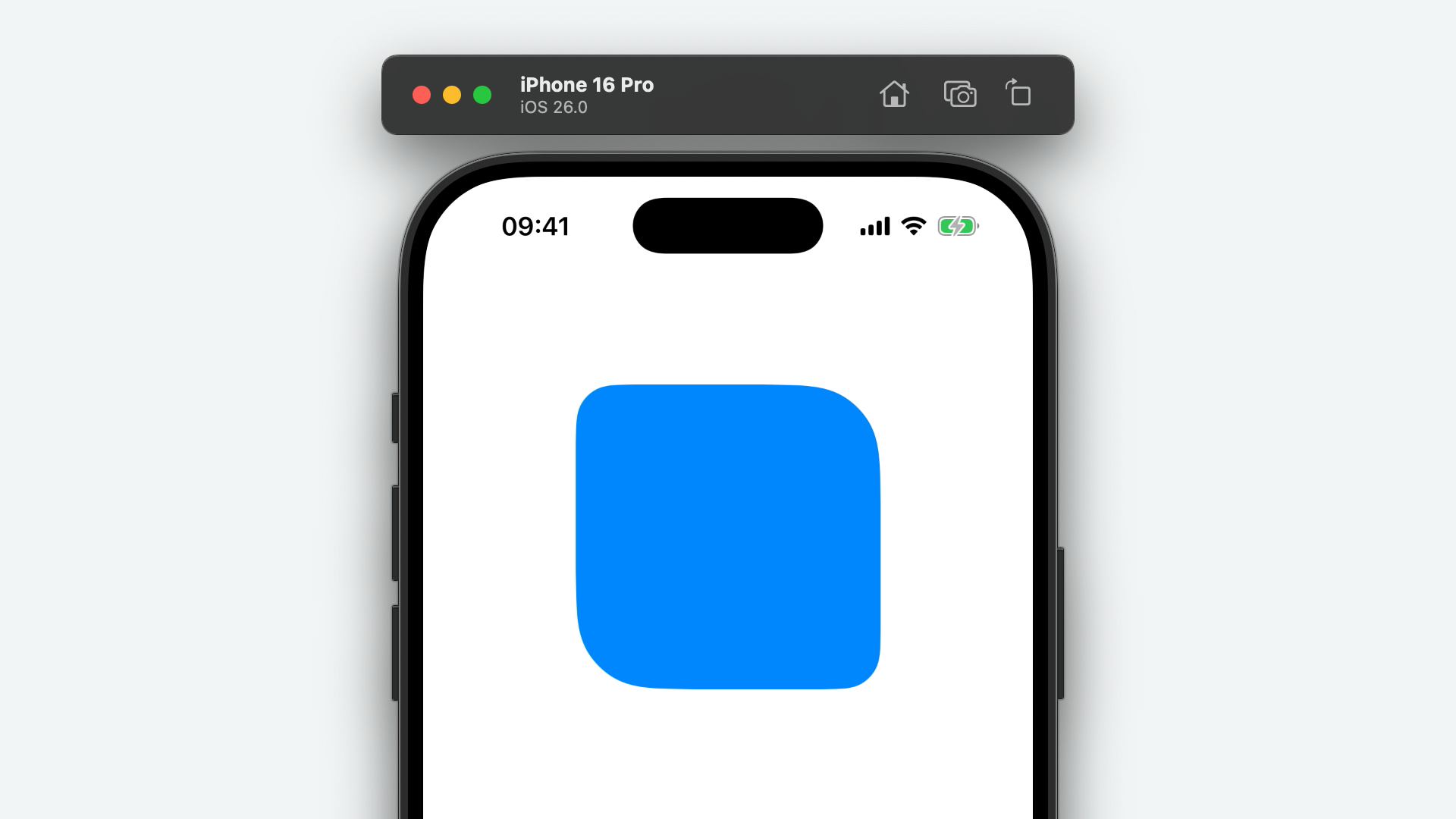
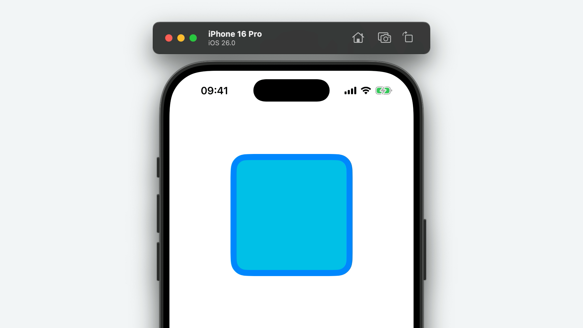
First, corners(radius:). This is the simplest of the static methods defined on UICornerConfiguration, applying the specified radius to all corners.
let rectangleView =UIView ()
rectangleView.backgroundColor = .systemBlue
rectangleView.cornerConfiguration = .corners (radius : .fixed (26 ))
In this instance, we passed in a fixed(_:) corner radius of 26 points - check out UICornerRadius for more possibilities!

UICornerConfiguration also has a static corners(topLeftRadius:topRightRadius:bottomLeftRadius:bottomRightRadius:) method which allows you to specify independent radii for each corner.
rectangleView.cornerConfiguration = .corners (
topLeftRadius : .fixed (26 ),
topRightRadius : .fixed (10 ),
bottomLeftRadius : .fixed (10 ),
bottomRightRadius : .fixed (26 )
)
The final configuration we'll look at is capsule(maximumRadius:)! Note the maximumRadius parameter has a default value of nil, so you can omit it entirely if you're not using it.
rectangleView.cornerConfiguration = .capsule ()
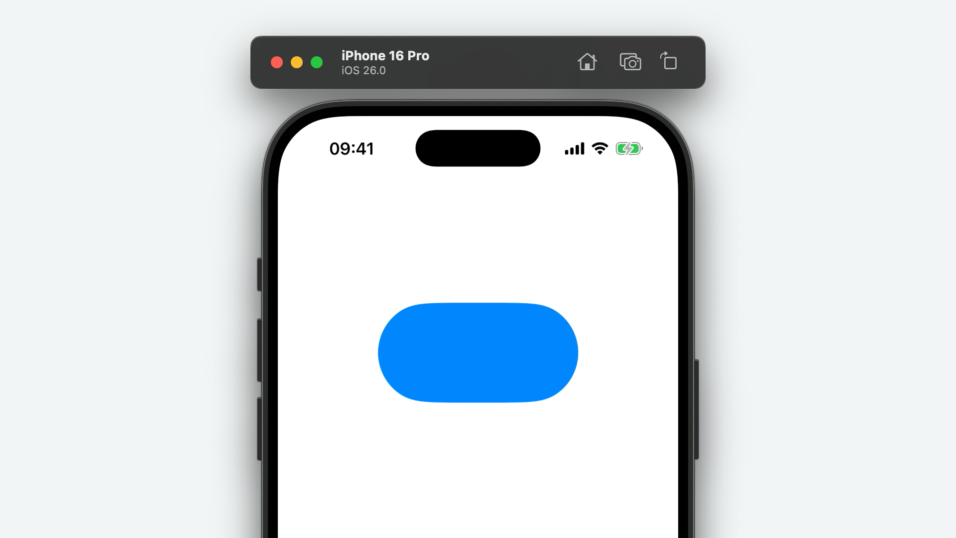
No more overriding layoutSubviews() to create a capsule-like view!
UICornerRadius
Above, I mentioned that I was pretty excited about UIKit's new corner configuration API - let's take a look at why!
The new UICornerRadius struct represents a radius of a rounded corner. As you've seen, this can be used to round the corners of views uniformly or independently.
rectangleView.cornerConfiguration = .corners (radius : .fixed (26 ))
rectangleView.cornerConfiguration = .corners (topLeftRadius : .fixed (26 ),topRightRadius : .fixed (52 ),bottomLeftRadius : .fixed (52 ),bottomRightRadius : .fixed (26 ))
However, there's more to this API!
struct UICornerRadius :Equatable ,Hashable ,ExpressibleByFloatLiteral ,ExpressibleByIntegerLiteral ,CustomStringConvertible {
static func fixed (_ radius:Double ) ->UICornerRadius
static func containerConcentric (minimum :CGFloat ? =nil ) ->UICornerRadius
}
As you can see, there is a static containerConcentric(minimum:) method, alongside fixed(_:). This is where it gets good.
Using a containerConcentric(minimum:) radius for your view's corner configuration will automatically calculate a corner radius concentric to the view's superview, in a similar fashion to SwiftUI's ContainerRelativeShape.
let containerView =UIView ()
containerView.backgroundColor = .systemBlue
containerView.cornerConfiguration = .corners (radius : .fixed (26 ))
let concentricView =UIView ()
concentricView.backgroundColor = .systemCyan
concentricView.cornerConfiguration = .corners (radius : .containerConcentric ())
view .addSubview (containerView)
containerView.addSubview (concentricView)
But that's not all! By far the best feature is corners that adapt to the shape of the window scene and, by extension, the shape of the display itself!
let concentricView =UIView ()
concentricView.backgroundColor = .systemBlue
concentricView.cornerConfiguration = .corners (radius : .containerConcentric ())
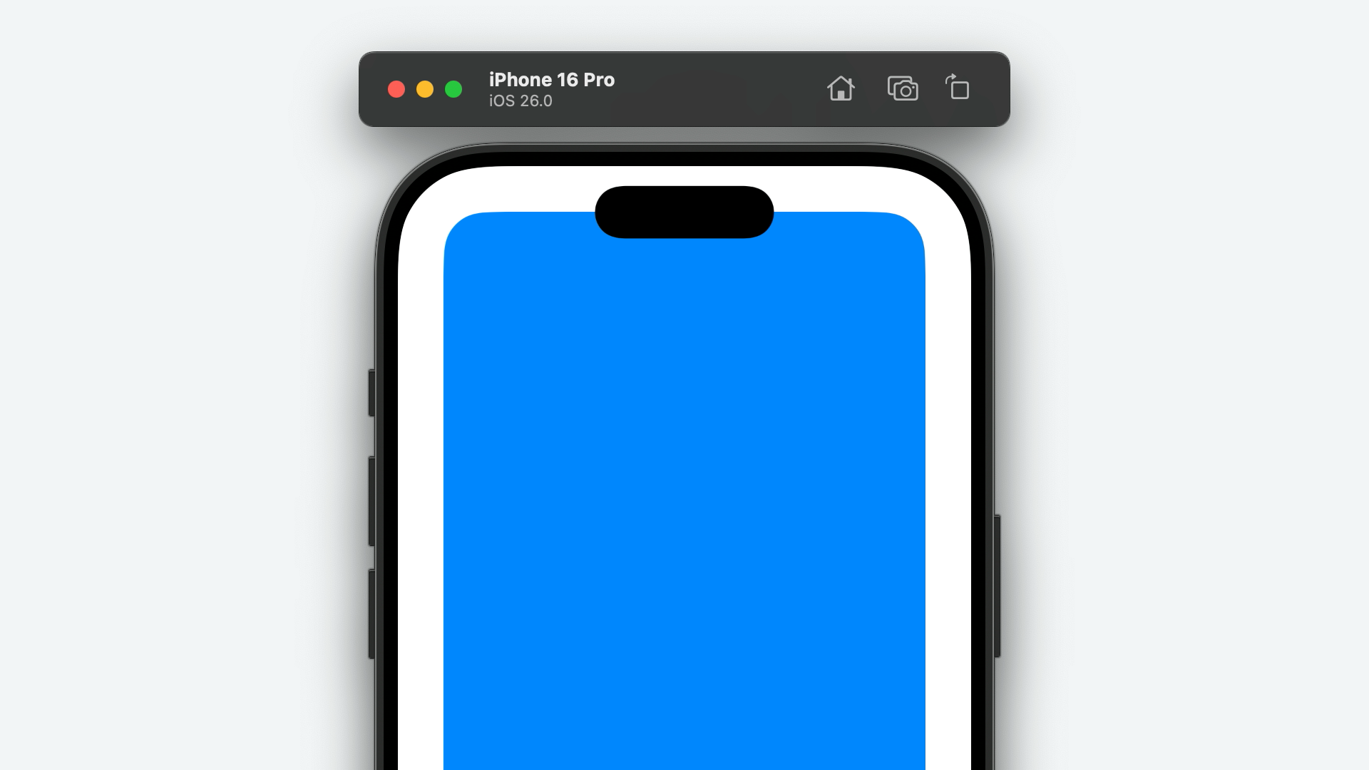
This has, of course, been possible for some time, albeit a little manually, with UIScreen's private _displayCornerRadius property. However, this is a fantastic example of Apple taking an API, that was previously behind closed doors, and transforming it into something that is worth more than the sum of its parts. They could have dropped the underscore, exposed _displayCornerRadius, and called it a day. Instead, what we got is an incredibly flexible API with deep integration throughout system components such as sheets, popovers and window scenes!
UIContextMenuSystem
UIContextMenuSystem is a new class that's been added in iOS 26 that does...nothing? OK, not quite nothing, but nothing new!
UIContextMenuSystem inherits from UIMenuSystem so you can access the usual class properties like main and context, and methods like setNeedsRebuild() and setNeedsRevalidate().
The only member of UIContextMenuSystem itself is its shared property for accessing the singleton instance.
class var shared :UIContextMenuSystem {get }
In fact, calling UIContextMenuSystem.shared is exactly the same as calling UIMenuSystem.context.
I believe this class has been added to mirror the new UIMainMenuSystem class which does offer a subset of APIs for managing the main menu.
UIDeferredMenuElement
As part of UIKit's slew of changes to support iPadOS's new macOS-like menu bar, UIDeferredMenuElement has been updated to support focus-based menus.
There's a new static usingFocus(identifier:shouldCacheItems:) method which, when inserted into the main menu system, populates its elements from the UIResponder chain.
let historyIdentifier =UIDeferredMenuElement .Identifier (rawValue :"com.example.deferred-history-element" )
let historyMenuElement =UIDeferredMenuElement .usingFocus (identifier : historyIdentifier,shouldCacheItems :false )
builder.insertElements ([historyMenuElement],atEndOfMenu : .view )
You can populate this menu by overriding the new provider(for:) method in your UIResponder subclass and returning an instance of UIDeferredMenuElement.Provider.
To support this behaviour, UIDeferredMenuElement has a new read-only identifier property of type UIDeferredMenuElement.Identifier.
open var identifier :UIDeferredMenuElement .Identifier {get }
Identifier
UIDeferredMenuElement.Identifier is a simple structure representing a unique identifier for a deferred menu element.
extension UIDeferredMenuElement {
struct Identifier :Hashable ,Equatable ,RawRepresentable {
init (_ rawValue:String )
init (rawValue :String )
}
}
Simply create an instance of this using either the init(_:) or init(rawValue:) initialisers and pass this into the static usingFocus(identifier:shouldCacheItems:) method.
Provider
Finally, on the UIDeferredMenuElement front, is a new class, Provider.
extension UIDeferredMenuElement {
class Provider :NSObject {
convenience init (_ elementProvider:@escaping (@escaping ([UIMenuElement ]) ->Void ) ->Void )
}
}
This class doesn't have any public members, other than its convenience init(_:) initialiser.
let provider =UIDeferredMenuElement .Provider { completionin
let elements: [UIMenuElement ] =// ...
completion(elements)
}
You'll return an instance of this class when overriding provider(for:) in your UIResponder subclass.
UIGlassEffect
In iOS 26, Liquid Glass really is the star of the show. UIGlassEffect is one of the main APIs that allow developers to take advantage of these new effects.
class UIGlassEffect :UIVisualEffect {
var isInteractive :Bool {get set }
var tintColor :UIColor ? {get set }
}
UIGlassEffect is a UIVisualEffect subclass, much like UIBlurEffect and UIVibrancyEffect. This means you'll (almost) always be using it alongside UIVisualEffectView.
You create an instance of UIGlassEffect using the init(style:) initialiser. This style parameter should be one of a couple of constants defined in the UIGlassEffect.Style class.
let glassEffect =UIGlassEffect (style : .regular )
let visualEffectView =UIVisualEffectView (effect : glassEffect)
let glassEffect =UIGlassEffect (style : .clear )
let visualEffectView =UIVisualEffectView (effect : glassEffect)
From here, you can customise the tint colour of the glass and whether or not the glass is interactive.
let glassEffect =UIGlassEffect (style : .regular )
glassEffect.tintColor = .tintColor
glassEffect.isInteractive =true
The tint colour does exactly what you'd expect, it gives you a sort of stained glass effect. Whether or not the effect is interactive is little more subtle. If true, the glass expands and various highlights are applied when the user taps the glass.
Style
UIGlassEffect.Style is a new enumeration, supporting iOS 26's UIGlassEffect API, defining a set of glass styles.
extension UIGlassEffect {
public enum Style :Int {
case regular =0
case clear =1
}
}
As of now, there are two styles available: regular and clear.
UIHDRHeadroomUsageLimit
UIHDRHeadroomUsageLimit is a simple enumeration supporting UITraitCollection's new hdrHeadroomUsageLimit property and the new UITraitHDRHeadroomUsageLimit trait definition.
enum UIHDRHeadroomUsageLimit :Int {
case unspecified =-1
case active =0
case inactive =1
}
These enum cases describes the current HDR headroom limitations of a view hierarchy. Specifically, whether or not a view's content should fall back to SDR content to better emphasize overlaid foreground content, such as a popover.
The unspecified case conveys a lack of HDR headroom limitation information, you'll see this case before your UIView subclass moves to its superview. The active case indicates that headroom usage limits are in effect and that your content should fall back to SDR. Finally, the inactive indicates that headroom usage limits are disabled and that your content can be displayed in HDR.
UIImage
SymbolConfiguration
UIImage.SymbolConfiguration has been updated with two new initialisers to support new symbol effects added in SF Symbols 7.
The first of the two is init(colorRenderingMode:) that takes a single argument of the new type UIImage.SymbolColorRenderingMode.
convenience init (colorRenderingMode mode:UIImage .SymbolColorRenderingMode )
This has been added to support SF Symbols' new gradient rendering mode. To get up and running, call init(colorRenderingMode:) with the gradient symbol colour rendering mode case.
let image =UIImage (systemName :"bolt.house.fill" )?.withConfiguration (
UIImage .SymbolConfiguration (colorRenderingMode : .gradient )
.applying (
UIImage .SymbolConfiguration (paletteColors : [.systemOrange ])
)
)
The second new initialiser is init(variableValueMode:). This takes a single argument of the new type UIImage.SymbolVariableValueMode.
convenience init (variableValueMode :UIImage .SymbolVariableValueMode )
This has been added to support the new draw effect added in SF Symbols 7. To use it, construct a symbol configuration with the init(variableValueMode:) initialiser, passing in the draw variable value mode case.
let image =UIImage (systemName :"command" )?.withConfiguration (
UIImage .SymbolConfiguration (variableValueMode : .draw )
)
SymbolColorRenderingMode
UIImage.SymbolColorRenderingMode is a new enumeration supporting SF Symbols 7's new gradient rendering mode - specifically, UIImage.SymbolConfiguration's new init(colorRenderingMode:) initialiser.
extension UIImage {
enum SymbolColorRenderingMode :Int {
case automatic =0
case flat =1
case gradient =2
}
}
This enum allows you to specify a symbol with a normal flat colour rendering mode, a gradient rendering mode, or the symbol's automatic rendering mode - either flat or gradient.
SymbolVariableValueMode
UIImage.SymbolVariableValueMode is a new enumeration supporting SF Symbols 7's new draw effect. You can use one of these cases to pass in to UIImage.SymbolConfiguration's new init(variableValueMode:) initialiser.
extension UIImage {
enum SymbolVariableValueMode :Int {
case automatic =0
case color =1
case draw =2
}
}
The color case will give you the existing variable colour effect which animates the symbol layer by layer depending on a given threshold (think Wi-Fi bars), draw will animate the symbol along its components paths as if it were actually being drawn by hand, and automatic will default to the symbol's preferred animation.
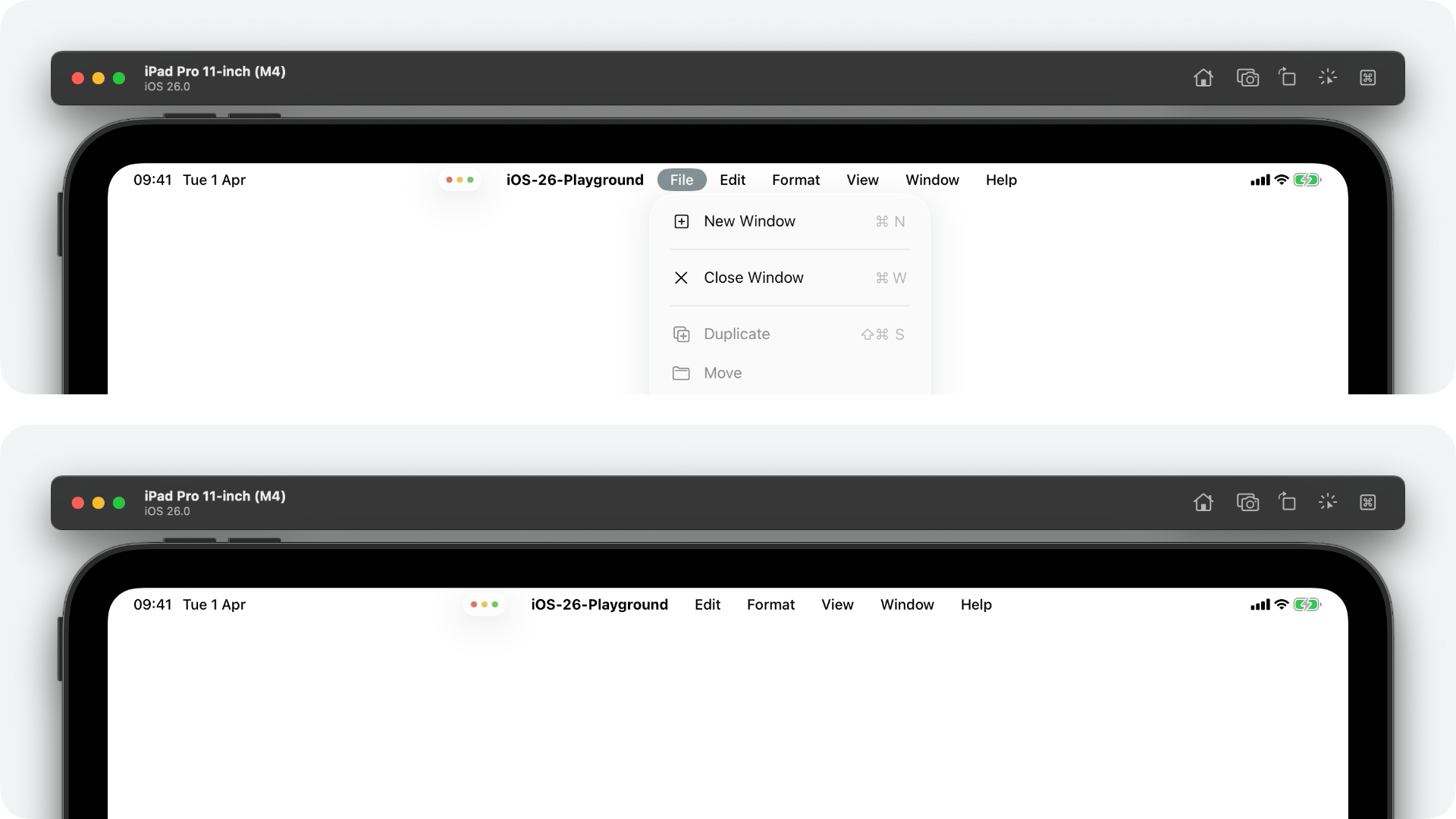
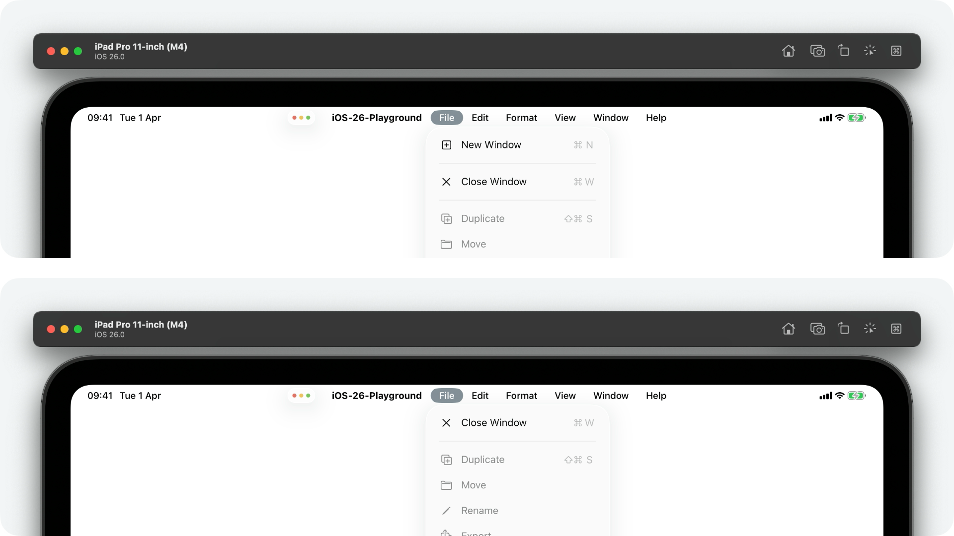
UIMainMenuSystem
UIMainMenuSystem is a new UIMenuSystem subclass in iOS 26 to support iPadOS' new macOS-like menu bar.
Like its superclass, you don't create an instance of UIMainMenuSystem yourself. Instead, you access a singleton instance through the class shared property.
class var shared :UIMainMenuSystem {get }
UIMainMenuSystem has a single member, setBuildConfiguration(_:buildHandler:).
func setBuildConfiguration (_ configuration:UIMainMenuSystem .Configuration , buildHandler: ((any UIMenuBuilder ) ->Void )? =nil )
Calling this method allows you to apply a new UIMainMenuSystem.Configuration and, optionally, provide a closure, called by the system, to customise an instance of UIMenuBuilder in a similar fashion to UIResponder's buildMenu(with:) method.
let configuration =UIMainMenuSystem .Configuration ()
UIMainMenuSystem .shared .setBuildConfiguration (configuration) { menuBuilderin
menuBuilder.remove (menu : .file )
}
In the example below, the system ran the provided buildHandler closure, removing the default File menu from the main menu.
Configuration
UIMainMenuSystem.Configuration is a new class that groups a bunch of properties for customising iPadOS' new main menu.
extension UIMainMenuSystem {
class Configuration :NSObject {
var newScenePreference :UIMenuSystem .ElementGroupPreference {get set }
var documentPreference :UIMenuSystem .ElementGroupPreference {get set }
var printingPreference :UIMenuSystem .ElementGroupPreference {get set }
var findingPreference :UIMenuSystem .ElementGroupPreference {get set }
var findingConfiguration :UIMenuSystem .FindElementGroupConfiguration {get }
var toolbarPreference :UIMenuSystem .ElementGroupPreference {get set }
var sidebarPreference :UIMenuSystem .ElementGroupPreference {get set }
var inspectorPreference :UIMenuSystem .ElementGroupPreference {get set }
var textFormattingPreference :UIMenuSystem .ElementGroupPreference {get set }
}
}
The new configuration class provides several properties, of type UIMenuSystem.ElementGroupPreference, for easily including or removing groups of menu elements.
let configuration =UIMainMenuSystem .Configuration ()
configuration.newScenePreference = .removed
UIMainMenuSystem .shared .setBuildConfiguration (configuration)
Functionally, this is very similar to using UIMainMenuSystem's setBuildConfiguration(_:buildHandler:) method and manually calling remove(menu: .newItem) on the menu builder passed into the closure - but it's a nice shorthand nonetheless.
Also new in this configuration class is the findingConfiguration property, of type UIMenuSystem.FindElementGroupConfiguration. This class contains a single property, style, of type UIMenuSystem.FindElementGroupConfiguration.Style - an enumeration with a few cases describing the subset of controls displayed in the system Find menu.
The first case we'll go over, is search. This replaces the Find and Replace menu with a single Search menu element, ideal for photo or music apps where the focus is on searching content rather than text.
let configuration =UIMainMenuSystem .Configuration ()
configuration.findingConfiguration .style = .search
UIMainMenuSystem .shared .setBuildConfiguration (configuration)
Up next is the nonEditableText case which displays a Find (no replace) menu.
There's also an editableText case for displaying a Find and Replace menu!
And, finally, an automatic case which allows the system to decide based on..."platform and system behaviours" according to the documentation!
UIMenu
Configuration
The UIMenu.Identifier structure provides a set of constants to identify system menu items.
In iOS 26, the newScene identifier has been deprecated in favour of a more generic newItem identifier.
static let newItem :UIMenu .Identifier
And a new findPanel identifier has been added for menus containing children such as Find, Find and Replace, Find Next, and Find Previous.
static let findPanel :UIMenu .Identifier
UIMenuBuilder
With the introduction of UIMainMenuSystem, supporting iPadOS' new macOS-like menu bar, the UIMenuBuilder protocol is going to become essential to a whole lot more apps!
Because of this, Apple have added a bunch of new methods to the protocol that make configuring menus a hell of a lot easier! For the sake of brevity, I won't go over them all individually but they're pretty self-explanatory.
func replace (menu replacedIdentifier:UIMenu .Identifier ,with replacementElements: [UIMenuElement ])
func replace (action replacedIdentifier:UIAction .Identifier ,with replacementElements: [UIMenuElement ])
func replace (command replacedAction:Selector ,propertyList replacedPropertyList:Any ? =nil ,with replacementElements: [UIMenuElement ])
func insertElements (_ insertedElements: [UIMenuElement ],beforeMenu siblingIdentifier:UIMenu .Identifier )
func insertElements (_ insertedElements: [UIMenuElement ],afterMenu siblingIdentifier:UIMenu .Identifier )
func insertElements (_ insertedElements: [UIMenuElement ],beforeAction siblingIdentifier:UIAction .Identifier )
func insertElements (_ insertedElements: [UIMenuElement ],afterAction siblingIdentifier:UIAction .Identifier )
func insertElements (_ childElements: [UIMenuElement ],atStartOfMenu parentIdentifier:UIMenu .Identifier )
func insertElements (_ childElements: [UIMenuElement ],atEndOfMenu parentIdentifier:UIMenu .Identifier )
func insertElements (_ insertedElements: [UIMenuElement ],beforeCommand siblingAction:Selector ,propertyList siblingPropertyList:Any ? =nil )
func insertElements (_ insertedElements: [UIMenuElement ],afterCommand siblingAction:Selector ,propertyList siblingPropertyList:Any ? =nil )
func remove (action removedIdentifier:UIAction .Identifier )
func remove (command removedAction:Selector ,propertyList removedPropertyList:Any ? =nil )
UIMenuElement
RepeatBehavior
UIMenuElement has been updated with a new, nested type, RepeatBehavior. This is an enumeration that describes how a menu element should respond to repeated interaction, such as the user holding down their associated keyboard shortcut keys.
extension UIMenuElement {
enum RepeatBehavior :Int {
case automatic =0
case repeatable =1
case nonRepeatable =2
}
}
You can assign any of the above cases to the new repeatBehavior property of any UIMenuLeaf subclass, such as UIAction or UIKeyCommand.
UIMenuLeaf
If you're reading this article chronologically, you'll have already have come across the new UIMenuElement.RepeatBehavior enum.
Well, UIMenuLeaf's repeatBehavior is the corresponding property!
var repeatBehavior :UIMenuElement .RepeatBehavior {get set }
This property controls whether or not a menu element's action can be performed repeatedly in quick succession, such as when the user holds down the element's corresponding keyboard shortcuts keys. This is particularly handy for destructive actions, such as a Delete menu element in an email app, where you don't want the action to be triggered in quick succession by accident.
Simply set the repeatBehavior property of your UIMenuLeaf-conforming object to one of the three RepeatBehavior cases: repeatable, nonRepeatable, or automatic to let the system decide.
let action =UIAction (title :"Delete" ) { actionin
// ...
}
action.repeatBehavior = .nonRepeatable
UIMenuSystem
To support UIMainMenuSystem's new Configuration object, UIMenuSystem has been updated with a few new type declarations.
ElementGroupPreference
UIMenuSystem.ElementGroupPreference is a new enumeration which provides cases describing whether or not a group of menu elements should be included in iPadOS' new main menu.
extension UIMenuSystem {
enum ElementGroupPreference :Int {
case automatic =0
case removed =1
case included =2
}
}
These cases can be assigned to a bunch of UIMainMenuSystem.Configuration's properties to conditionally show or hide menu element groups. Check out UIMainMenuSystem.Configuration to see these properties in action!
FindElementGroupConfiguration
Also new in UIMenuSystem is the FindElementGroupConfiguration class which provides a set of options specifically for customising the Find menu element group.
extension UIMenuSystem {
class FindElementGroupConfiguration :NSObject {
var style :UIMenuSystem .FindElementGroupConfiguration .Style
}
}
As of now, there's only one property, style, which can be set to one of the four cases in the new UIMenuSystem.FindElementGroupConfiguration.Style enumeration.
Style
UIMenuSystem.FindElementGroupConfiguration.Style is a new enumeration supporting UIMenuSystem's new FindElementGroupConfiguration class. It several cases that describe which children of the Find and Replace menu element group should be displayed.
extension UIMenuSystem .FindElementGroupConfiguration {
enum Style :Int {
case automatic =0
case search =1
case nonEditableText =2
case editableText =3
}
}
Assigning the automatic case to a find menu element group configuration's style property will allow the system to decide how best to display the Find and Replace menu. The search case will remove Find and Replace options, substituting them with a simple Search element. The nonEditableText will give you just Find options, where Replace is not appropriate. And editableText will give you the full Find and Replace functionality.
Again, check out UIMainMenuSystem.Configuration to learn more!
UIModalPresentationStyle
I bet an update to UIModalPresentationStyle wasn't on your WWDC 2025 bingo card, yet here we are! It's hardly a belter, but the formSheet presentation style in now available on tvOS!
Somewhere, someone out there just punched the air...
UIMutableTraits
This year, Apple have added several new traits to UITraitCollection relating to tab bar accessories, split view controller layout environments, and more!
Because UIMutableTraits is somewhat auxiliary to UITraitCollection, I've covered the bulk of the changes in that section, further down this page.
To support these changes, UIMutableTraits has been updated with several new properties.
extension UIMutableTraits {
var headroomUsageLimit :UITraitHDRHeadroomUsageLimit .Value {get set }
var resolvesNaturalAlignmentWithBaseWritingDirection :Bool {get set }
var splitViewControllerLayoutEnvironment :UISplitViewController .LayoutEnvironment {get set }
var tabAccessoryEnvironment :UITabAccessory .Environment {get set }
}
Check out the section on UITraitCollection to learn more!
UINavigationBarAppearance
UINavigationBarAppearance has been updated with a number of new properties to support the exciting additions to UINavigationItem.
There's now a new property for customising the default appearance of navigation bar subtitles with subtitleTextAttributes.
var subtitleTextAttributes : [NSAttributedString .Key :Any ] {get set }
And a new property for customising the default appearance of large subtitles too with largeSubtitleTextAttributes.
var largeSubtitleTextAttributes : [NSAttributedString .Key :Any ] {get set }
Finally, inline with the changes made to UIBarButtonItem.Style and UIToolbarAppearance, the doneButtonAppearance property has been deprecate in favour of the new prominentButtonAppearance property.
var prominentButtonAppearance :UIBarButtonItemAppearance {get set }
UINavigationController
In iOS 26, it's now possible to interactively dismiss a view controller embedded in a navigation controller by performing a leading to trailing swipe anywhere on the screen. Previously, this was only possible when initiating the swipe from the screen's leading edge.
There was, however, a catch that almost every seasoned iOS developer has run into at some point in their career. If you hide the navigation bar's back button, likely in favour of your own custom back button, the underlying pan gesture recogniser would silently fail.
The workaround? Set the delegate of the navigation controller's interactivePopGestureRecognizer to an object of your choosing, adding the required UIGestureRecognizerDelegate protocol conformance, and returning true from gestureRecognizerShouldBegin(_:).
In iOS 26, there's a new interactiveContentPopGestureRecognizer property of UINavigationController.
var interactiveContentPopGestureRecognizer :UIGestureRecognizer ? {get }
Now, we can force that gesture recogniser to begin even when that pesky back button is hidden!
UINavigationItem
If you follow me on Twitter, you'll know that I have an unhealthy obsession with navigation bars on iOS. So, you can imagine my delight when I saw a whopping 81 additions to UINavigationItem.h when diffing iOS 26's UIKit headers.
Before you get too excited, the _bottomPalette API is still not...an API - but there are a lot of goodies for us navigation bar fans to sink our teeth into!
First of all, a new attributedTitle property!
var attributedTitle :AttributedString ? {get set }
This, for me, has been long awaited as UINavigationBar's titleTextAttributes and largeTitleTextAttributes properties always felt a little limited, only supporting attributes applied to the entire string, rather than portions of the string defined by NSRanges.
var attributedSting =AttributedString ("Title" )
attributedSting.foregroundColor =UIColor .systemBlue
navigationItem .attributedTitle = attributedSting
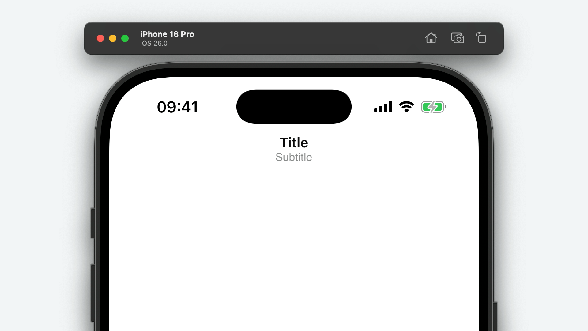
A new subtitle property has been added that, when set, is displayed below the navigation bar's title view.
var subtitle :String ? {get set }
navigationItem .subtitle ="Subtitle"
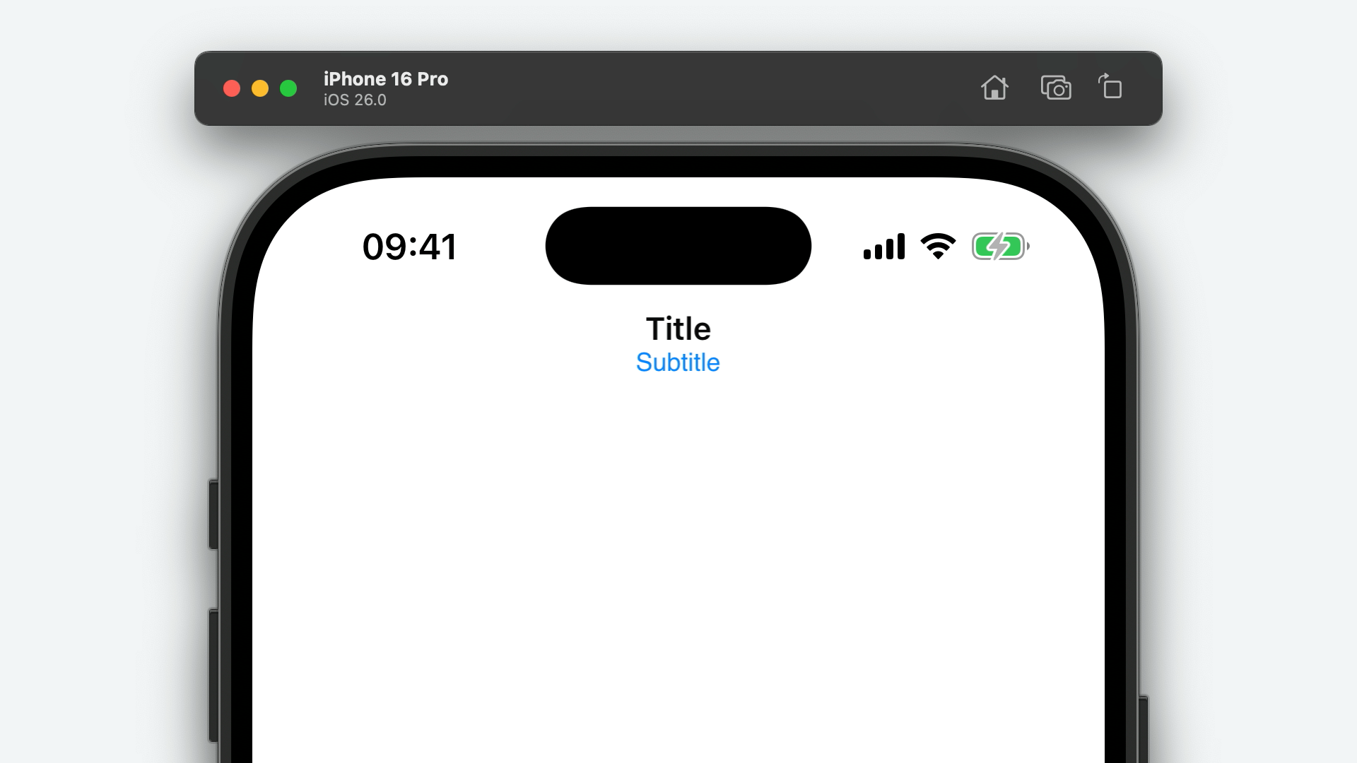
There's also a corresponding attributedSubtitle property to match the new attributedTitle.
var attributedSubtitle :AttributedString ? {get set }
var attributedSting =AttributedString ("Subtitle" )
attributedSting.foregroundColor =UIColor .systemBlue
navigationItem .attributedSubtitle = attributedSting
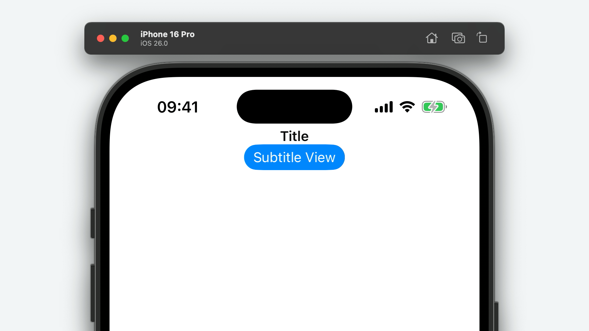
On top of that, there's even a new subtitleView property to go alongside UINavigationItem's titleView which has been available since iOS 2!
var subtitleView :UIView ? {get set }
let button =UIButton ()
button.configuration = .borderedProminent ()
button.configuration ?.title ="Subtitle View"
navigationItem .subtitleView = button
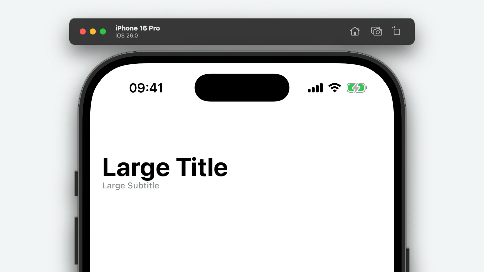
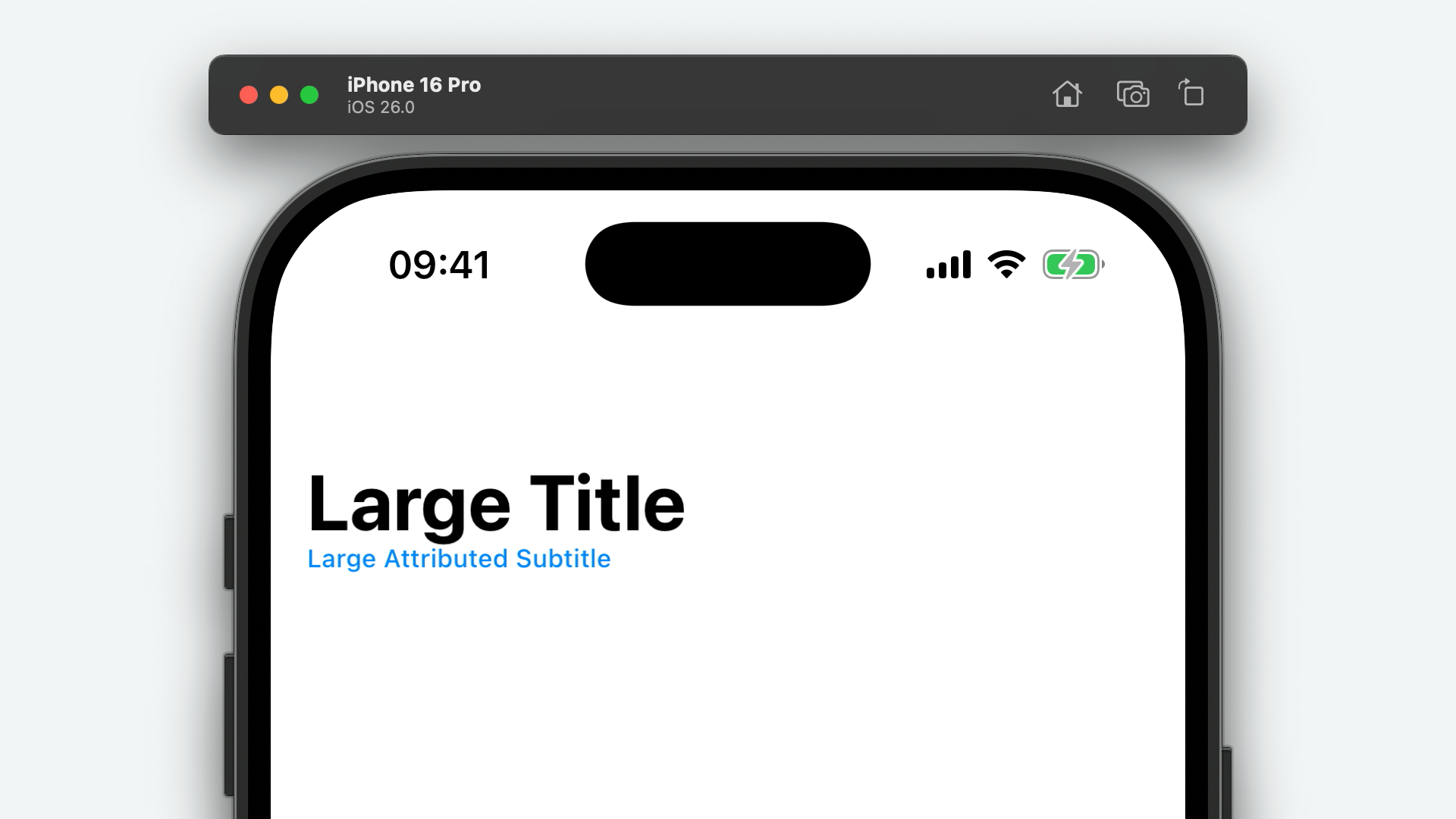
Also new is a separate largeTitle property which allows you to have a large title that differs from the navigation bar's compact title.
var largeTitle :String ? {get set }
navigationItem .title ="Title"
navigationItem .largeTitle ="Large Title"
A corresponding largeSubtitle property has also been added which will display a subtitle label underneath the large title, on the leading edge.
var largeSubtitle :String ? {get set }
navigationItem .largeSubtitle ="Large Subtitle"
And, of course, there is a matching largeAttributedSubtitle property.
var largeAttributedSubtitle :AttributedString ? {get set }
var attributedSting =AttributedString ("Large Attributed Subtitle" )
attributedSting.foregroundColor =UIColor .systemBlue
navigationItem .largeAttributedSubtitle = attributedSting
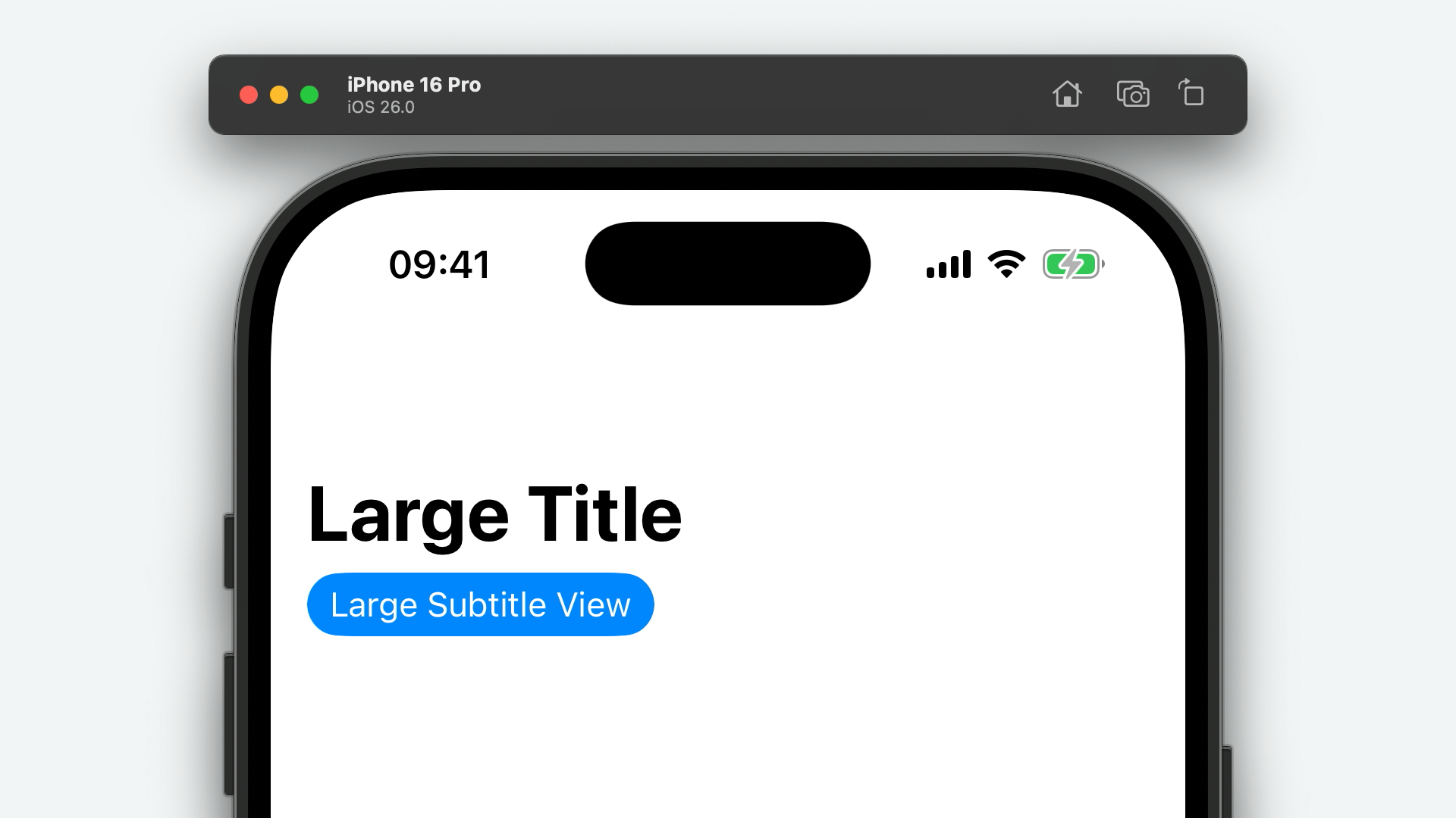
And, lastly, on the navigation bar title-subtitle customisation front, is largeSubtitleView.
var largeSubtitleView :UIView ? {get set }
let button =UIButton ()
button.configuration = .borderedProminent ()
button.configuration ?.title ="Large Subtitle View"
navigationItem .largeSubtitleView = button
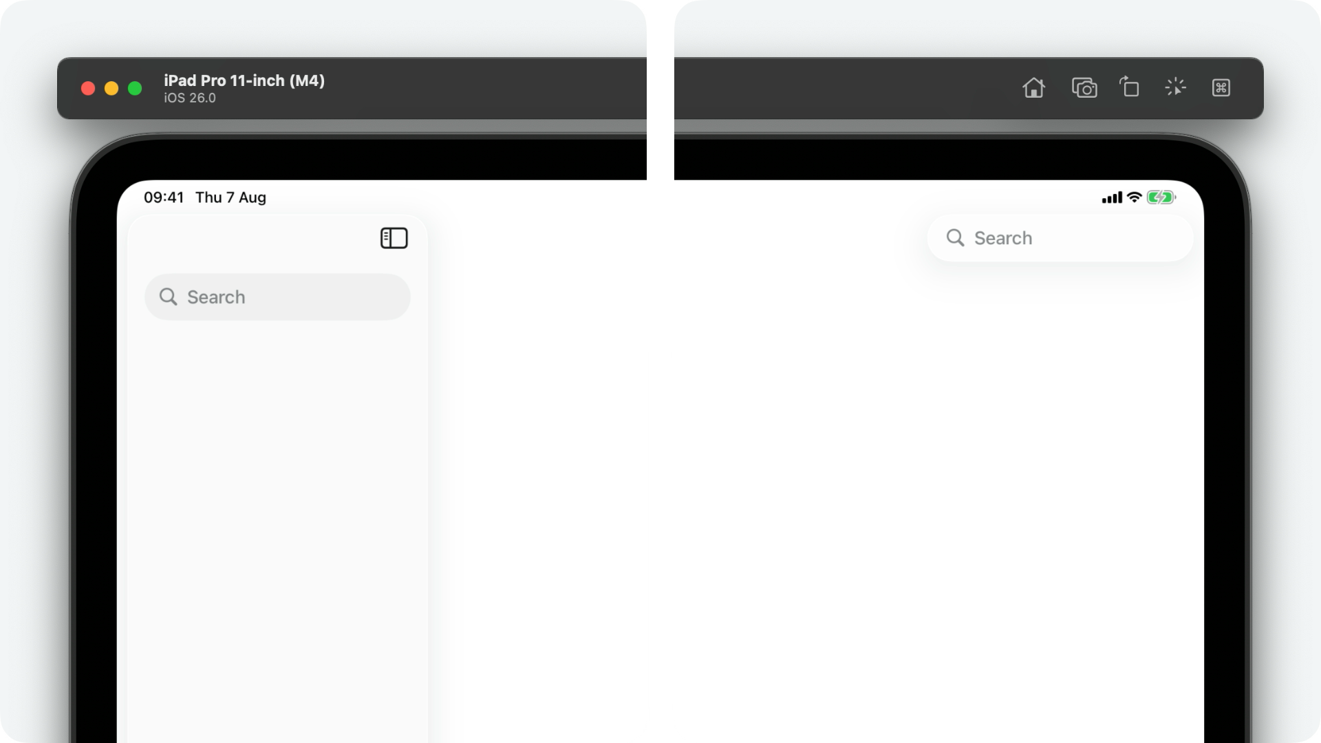
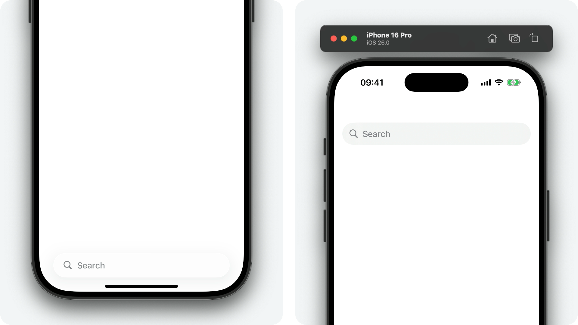
That's not all that's new with UINavigationItem, however. We also have several new properties for customising the the position of the navigation bar's search bar.
First of all is a new property named searchBarPlacementAllowsExternalIntegration.
var searchBarPlacementAllowsExternalIntegration :Bool {get set }
This property, which is false by default, allows an ancestor view controller to take the search bar and place it somewhere other than the navigation bar. If set to true, a UISplitViewController might place the search bar in the trailing-most column's navigation bar on iPadOS.
let sidebarViewController =SidebarViewController ()
sidebarViewController.navigationItem .searchController =UISearchController ()
sidebarViewController.navigationItem .searchBarPlacementAllowsExternalIntegration =true
viewControllers = [
sidebarViewController,// ...
]
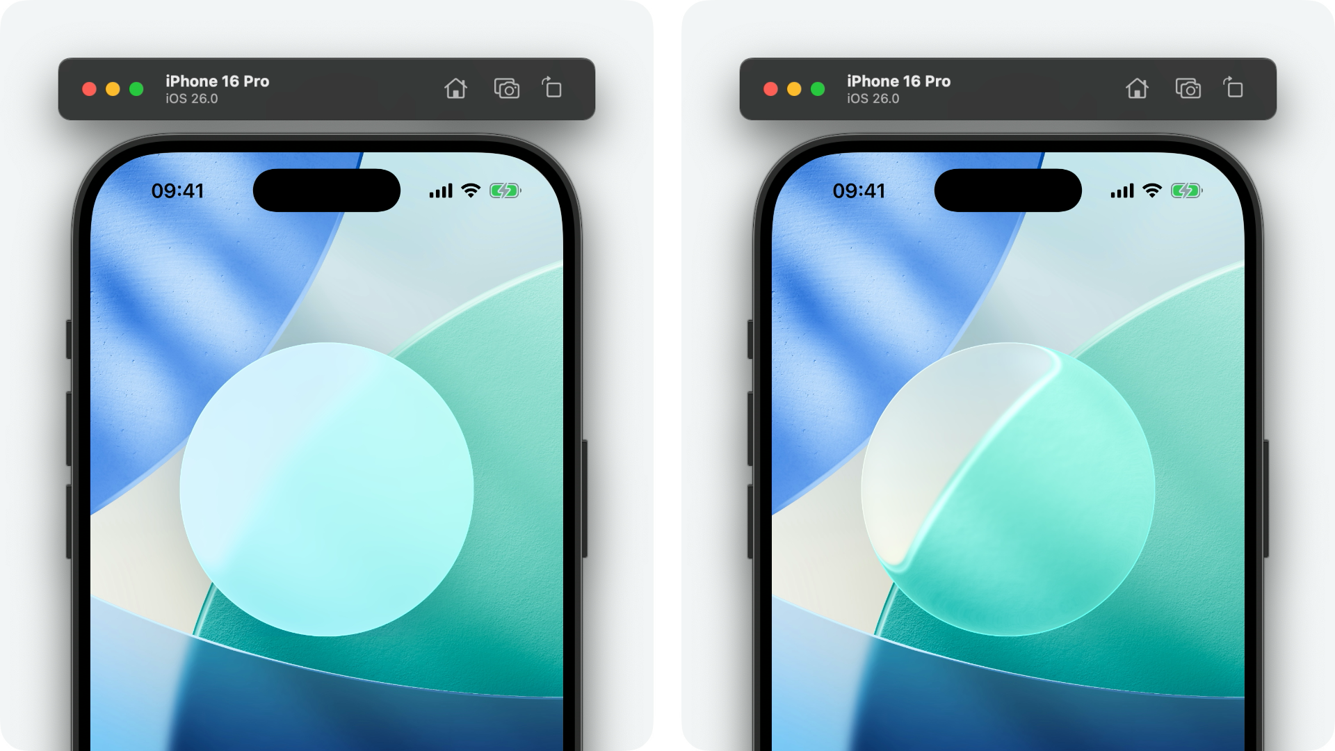
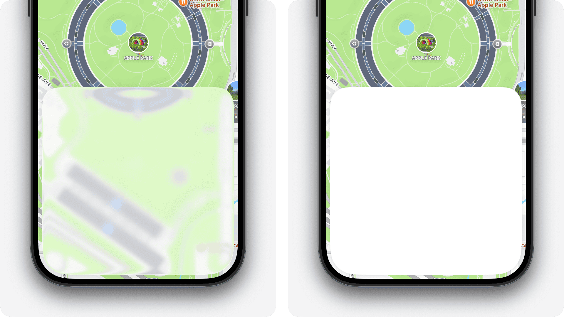
In the example below, settingsearchBarPlacementAllowsExternalIntegration to false (on the left) places sidebarViewController's search bar within its own navigation bar. Setting the property to true (on the right) allows the containing split view controller to the place the search bar in its trailing-most column.
Similarly, on iOS, the system will sometimes place the search bar in a view controller's toolbar. This may or may not be what you want, so, to support this change, a new searchBarPlacementAllowsToolbarIntegration property has been added.
var searchBarPlacementAllowsToolbarIntegration :Bool {get set }
The default value is true so if you want to opt out of this behaviour, just flip this property to false.
If you already have a toolbar, you can integrate the search bar amongst your existing bar button items, positioning it exactly where you want with the new searchBarPlacementBarButtonItem property.
var searchBarPlacementBarButtonItem :UIBarButtonItem {get }
let addBarButtonItem =UIBarButtonItem (systemItem : .add)
toolbarItems = [navigationItem .searchBarPlacementBarButtonItem , .flexibleSpace (), addBarButtonItem]
SearchBarPlacement
To support the various new search bar placements, Apple have updated the UINavigationItem.SearchBarPlacement - the cases of which can be assigned to UINavigationItem's preferredSearchBarPlacement property.
Before we take a look at the new cases, Apple have deprecated the existing inline case - the documentation states that this case has been renamed to integrated.
This new integrated case places the search within toolbars or the navigation bar, either as a search field or a button depending on the available space.
case integrated =1

The new integratedButton case also positions the search bar in the toolbar or navigation bar, however always as a button, regardless of the available space.
case integratedButton =4
There's also a new integratedCentered case which behaves the same as integrated except, when the search bar's owning view controller is a descendant of a [UITabBarController] or has a navigation item style of browser or editor, centers the search bar in the navigation bar.
case integratedCentered =3
UIPresentationController 26.1
New in the 26.1 SDK is UIPresentationController's backgroundEffect property.
var backgroundEffect :UIVisualEffect ? {get set }
By default, this property doesn't do anything as UIPresentationController is somewhat abstract — it's designed to be subclassed. You can make use of this new property by overriding the backgroundEffect setter in your presentation controller subclass and updating a UIVisualEffectView's effect with the new value, for example.
In fact, this is exactly what Apple do with the presentation controller subclass, UISheetPresentationController, which has also received an update in the 26.1 SDK. Read on to learn more!
UIResponder
UIResponder has been updated with a new provider(for:) method to support UIDeferredMenuElement's new focus-based menu elements.
func provider (for deferredElement:UIDeferredMenuElement ) ->UIDeferredMenuElement .Provider ?
When overriding this method, you can check the deferredElement's identifier property and conditionally return a UIDeferredMenuElement.Provider if needed.
override func provider (for deferredElement:UIDeferredMenuElement ) ->UIDeferredMenuElement .Provider ? {
let historyIdentifier =UIDeferredMenuElement .Identifier (rawValue :"com.example.deferred-history-element" )
if deferredElement.identifier == historyIdentifier {
return UIDeferredMenuElement .Provider { completionin
let elements =browserProfile .historyElements ()
completion(elements)
}
}
return nil
}
UIResponderStandardEditActions
The UIResponderStandardEditActions protocol has been updated with a handful of new methods for your UIResponder subclass to implement to support iPadOS's new main menu system. These include...
optional func alignCenter (_ sender:Any ?)
optional func alignJustified (_ sender:Any ?)
optional func alignLeft (_ sender:Any ?)
optional func alignRight (_ sender:Any ?)
optional func newFromPasteboard (_ sender:Any ?)
optional func performClose (_ sender:Any ?)
optional func showWritingTools (_ sender:Any ?)
optional func toggleInspector (_ sender:Any ?)
optional func toggleSidebar (_ sender:Any ?)
Override any of these new methods in your UIResponder subclass to enable their respective menu elements in the main menu.
class TextEditorViewController :UIViewController {
var textView :UITextView !
override func alignCenter (_ sender:Any ?) {
textView .textAlignment = .center
}
}
Interestingly, as of the iOS 26 beta 4 SDK, toggleSidebar(_:) back-deploys all the way back to iOS 15! Do with that what you will...
UIScene
In visionOS 26, users can now persist windows, volumes, and widgets in physical space. These persisted user interface elements are tied to the rooms they were used in, meaning that, if the user leaves the room and comes back a later time, their locked windows are right where they left them!
This behaviour is enabled by default but may not be appropriate for all windows, like welcome screens or login prompts. To opt out, you can use a new property of UIScene called destructionConditions.
var destructionConditions :Set <UIScene .DestructionCondition > {get set }
Simply set the value of this property to a Set generic over the new UIScene.DestructionCondition type, including the systemDisconnection condition.
class SceneDelegate :UIResponder ,UIWindowSceneDelegate {
var window :UIWindow ?
func scene (_ scene:UIScene ,willConnectTo session:UISceneSession ,options connectionOptions:UIScene .ConnectionOptions ) {
let windowScene = sceneas !UIWindowScene
windowScene.destructionConditions = [.systemDisconnection ]
let window =UIWindow (windowScene : windowScene)
window.rootViewController =ViewController ()
window.makeKeyAndVisible ()
self .window = window
}
}
Furthermore, in the case that a secondary window, such as a toolbar, was the last active scene before your app was terminated by the user, UIKit might try to relaunch this scene the next time a user opens your app from the home view.
To avoid this, add the userInitiatedDismissal option to the secondary scene's destruction conditions.
DestructionCondition
UIScene.DestructionCondition is a new structure defining some constants that describe how a scene should behave with visionOS' new automatic scene restoration behaviour.
extension UIScene {
struct DestructionCondition :Hashable ,Equatable ,Sendable ,CustomStringConvertible {
static var systemDisconnection :UIScene .DestructionCondition {get }
static var userInitiatedDismissal :UIScene .DestructionCondition {get }
}
}
There are currently two constants defined.
Firstly, systemDisconnection. Adding this to your window scene's destructionConditions means this scene will never be restored when the system closes your app as a result of the user leaving the physical space your app's window was placed.
And secondly, userInitiatedDismissal. UIKit will disregard any scene whose destruction conditions contains this property for restoration when the user opens your app from a closed state.
UISceneSession
Role
This year, UISceneSession.Role has been updated with a new static constant windowAssistiveAccessApplication.
static let windowAssistiveAccessApplication :UISceneSession .Role
Assistive Access is a system-wide experience that simplifies the user interface to make navigation iOS and iPadOS easier for people with cognitive disabilities.
It does so by reducing the number of elements on screen at any one time, streamlining interactions, adhering to consistent design practices, and providing clear pathways to success.
Up until now, we've had to rely on AccessibilitySettings's static isAssistiveAccessEnabled property to determine whether or not to adapt our UI for assistive access. While helpful, this encouraged developers to pepper these checks throughout their codebases which led to a lot of additional code that was harder to reason about.
This new windowAssistiveAccessApplication role allows us to create entirely separate scenes, specifically for Assistive Access, encouraging purpose-written code that is, as a result, much easier to reason about.
class AppDelegate :UIResponder ,UIApplicationDelegate {
func application (_ application:UIApplication ,configurationForConnecting connectingSceneSession:UISceneSession ,options :UIScene .ConnectionOptions ) ->UISceneConfiguration {
let role = connectingSceneSession.role
let configuration =UISceneConfiguration (name :nil ,sessionRole : role)
if connectingSceneSession.role == .windowAssistiveAccessApplication {
configuration.delegateClass =AssistiveAccessSceneDelegate .self
}
return configuration
}
}
UIScrollEdgeEffect
UIScrollEdgeEffect is a new class in iOS 26 that allows you to customise the appearance of the new visual effects applied beneath system bars.
class UIScrollEdgeEffect :NSObject {
var style :UIScrollEdgeEffect .Style {get set }
var isHidden :Bool {get set }
}
Adjusting the style property with one of the cases defined in the new UIScrollEdgeEffect.Style enumeration changes how the effect looks, check out the difference between these styles a little further down.
Setting the isHidden property to true completely disables the effect. The default value is false.
You don't initialise an instance of this class yourself. Instead, you can customise these values through several new properties of UIScrollView such as topEdgeEffect.
Style
UIScrollEdgeEffect.Style is a new class supporting UIScrollEdgeEffect. This class defines three constants for customising the style of the scroll edge effect.
extension UIScrollEdgeEffect {
class Style :NSObject {
class var automatic :UIScrollEdgeEffect .Style {get }
class var soft :UIScrollEdgeEffect .Style {get }
class var hard :UIScrollEdgeEffect .Style {get }
}
}
Below is an example of the soft and hard styles.
The soft style provides us with a subtle variable blur effect, combined with a gradient scrim — the colour for which is derived from the content beneath your scroll view. The hard style results in an appearance similar to the pre-iOS 26 material, albeit with an updated visual effect and the lack of a hairline shadow. The automatic style provides you with the system's default scroll edge effect, soft.
UIScrollEdgeElementContainerInteraction
On iOS 26, scroll views underneath navigation bars or toolbars automatically apply a variable blur and gradient colour overlay to their edges, ensuring legibility of overlapping content.
This effect isn't limited to system bars, however - we can use it with any custom container view that overlays an edge of a scroll view. How? With a new UIInteraction, UIScrollEdgeElementContainerInteraction, of course!
class UIScrollEdgeElementContainerInteraction :NSObject ,UIInteraction {
weak var scrollView :UIScrollView ? {get set }
var edge :UIRectEdge {get set }
}
Simply create an instace of UIScrollEdgeElementContainerInteraction using the init() initialiser, set its scrollView property to your content scroll view, set your preferred edge, and call addInteraction(_:) on your container view.
let interaction =UIScrollEdgeElementContainerInteraction ()
interaction.scrollView = textView
interaction.edge = .bottom
let buttonsContainerView =UIView ()
buttonsContainerView.addInteraction (interaction)
Notably abscent is the option to set the edge effect's style, as per UIScrollEdgeEffect.
UIScrollView
Unfortunately, in iOS 26, we did not get a variable blur effect API. -[UIBlurEffect effectWithVariableBlurRadius:imageMask:] exists, and Apple make liberal use of this throughout their own apps, but it remains behind closed doors.
With that moaning out of the way, we did get a couple of APIs that allow us to create a similar effect under certain circumstances...
...with limits.
Among these APIs are UIScrollView's new edge effect properties.
var topEdgeEffect :UIScrollEdgeEffect {get }
var leftEdgeEffect :UIScrollEdgeEffect {get }
var bottomEdgeEffect :UIScrollEdgeEffect {get }
var rightEdgeEffect :UIScrollEdgeEffect {get }
These new properties, all of type UIScrollEdgeEffect, control the subtle blur effect and colour overlay shown beneath system chrome, like navigation or tab bars.
You can customise the intensity of this effect by adjusting the scroll edge effect's style property, which can be one of the two UIScrollEdgeEffect.Style enum cases. You can also disable the effect entirely by setting the isHidden property to true, but that's where the customisation ends, I'm afraid.
scrollView.topEdgeEffect .style = .soft
scrollView.topEdgeEffect .isHidden =false
Of course, these properties are accessible to all UIScrollView subclasses like UITableView, UICollectionView and UITextView.
UIScrollView also has a new received a new property supporting visionOS' new Look to Scroll feature, lookToScrollAxes.
var lookToScrollAxes :UIAxis {get set }
When enabled, the scroll view will automatically begin scrolling in the relevant direction when the user's gaze moves towards the edge of the scroll view.
This behaviour is opt-in, so, to get this up and running, simply set the value of the lookToScrollAxes property to one of the options defined in the UIAxis option set: horizontal, vertical or both.
let scrollView =UIScrollView ()
scrollView.lookToScrollAxes = .vertical
UISearchBarDelegate
To support Apple's new Natural Selection feature, UISearchBarDelegate has been updated with one deprecation and one new method. The deprecated method in question is searchBar(_:shouldChangeTextIn:replacementText:) which has been replaced with searchBar(_:shouldChangeTextInRanges:replacementText:).
optional func searchBar (_ searchBar:UISearchBar ,shouldChangeTextInRanges ranges: [NSValue ],replacementText :String ) ->Bool
UISearchController
There are no changes to UISearchController's interface, just a slight change in the behaviour of hidesNavigationBarDuringPresentation.
Previously, the default value of this property was true. However, on iOS 26, the default value is "determined by context". So, unless you explicitly set this property to true or false via the API, the behaviour may not be consistent.
UISearchTab
UISearchTab has a new automaticallyActivatesSearch property that, when set to true, automatically activates the search field when the tab becomes active. For this to work, the navigationItem of the search tab's view controller should have a non-nil searchController.
tabs = [
UISearchTab { tabin
let searchTab = tabas !UISearchTab
searchTab.automaticallyActivatesSearch =true
let searchViewController =SearchViewController ()
searchViewController.navigationItem .searchController =UISearchController ()
return UINavigationController (rootViewController : searchViewController)
}
]
It's also worth noting that, when setting automaticallyActivatesSearch to true, the previously selected tab will become active when the user cancels the search.
UISheetPresentationController 26.1
Earlier in this article, we looked at UIPresentationController's new backgroundEffect property and how your subclass can take advantage of it.
UISheetPresentationController gains the same backgroundEffect API as its superclass as it overrides the property to implement custom behaviour, much like you would in your own subclass.
var backgroundEffect :UIVisualEffect ? {get set }
In the case of sheet presentation controller, this updates the background effect of the presented sheet. See the example below where, on the left, the background effect is nil, resulting in the default glass background, and, on the right, the background effect is an instance of the new UIColorEffect, resulting in a solid background colour.
sheetPresentationController ?.backgroundEffect =nil
sheetPresentationController ?.backgroundEffect =UIColorEffect (color : .systemBackground )
You can, of course, use any UIVisualEffect here, including the "old" UIBlurEffects.
UISlider
In iOS 17, a new, private _sliderStyle property was added to UISlider to support the new fluid sliders seen across apps like Music and Podcasts. This year, the underscore has been dropped and sliderStyle is available to us all!
var sliderStyle :UISlider .Style {get set }
Simply set the value of this property to one of the new UISlider.SliderStyle enumeration cases, default or thumbless.
let slider =UISlider ()
slider.sliderStyle = .default
let slider =UISlider ()
slider.sliderStyle = .thumbless
Next on the UISlider front is a new trackConfiguration property!
var trackConfiguration :UISlider .TrackConfiguration ? {get set }
This is a fantastic new API for adding tick marks to a slider, but it's far from just visual, with options to control the starting point (or neutral value) of the slider, whether or not the slider snaps to a tick value, and more!
let slider =UISlider ()
slider.trackConfiguration =UISlider .TrackConfiguration (numberOfTicks :5 )
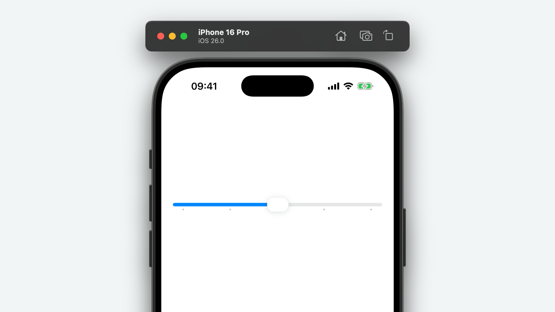
Check out more details about UISlider.TrackConfiguration a little further down!
SliderStyle
UISlider.SliderStyle is a new enumeration that's been added to support UISlider's new sliderStyle property. It has two cases, default and thumbless.
extension UISlider {
enum SliderStyle :Int {
case `default`
case thumbless
}
}
Assign one of these enum cases to the sliderStyle property of a UISlider to customise the appearance and behaviour of the slider.
TrackConfiguration
UISlider.TrackConfiguration is a new structure supporting UISlider's trackConfiguration property, added in iOS 26.
extension UISlider {
struct TrackConfiguration :Hashable {
var allowsTickValuesOnly :Bool {get set }
var neutralValue :Float {get set }
var enabledRange :ClosedRange <Float > {get set }
let ticks : [UISlider .TrackConfiguration .Tick ]
init (allowsTickValuesOnly :Bool =true ,neutralValue :Float =0 ,enabledRange :ClosedRange <Float > =0 ...1 ,ticks : [UISlider .TrackConfiguration .Tick ])
init (allowsTickValuesOnly :Bool =true ,neutralValue :Float =0 ,enabledRange :ClosedRange <Float > =0 ...1 ,numberOfTicks :Int )
}
}
You can create an instace of TrackConfiguration using either the init(allowsTickValuesOnly:neutralValue:enabledRange:ticks:) or init(allowsTickValuesOnly:neutralValue:enabledRange:numberOfTicks:) initialisers.
Helpfully, most of these initialisers' parameters have default values, so you can just construct a track configuration with init(ticks:) or init(numberOfTicks:).
Let's start by looking at the allowsTickValuesOnly property, which ensures the slider snaps to its tick values.
var trackConfiguration =UISlider .TrackConfiguration (numberOfTicks :5 )
trackConfiguration.allowsTickValuesOnly =true
slider.trackConfiguration = trackConfiguration
It's worth noting that when adding a UIControl.Event.valueChanged action, the slider only reports changes to the slider's value when it's equal to the float value of one of the ticks.
Next, we have the neutralValue property. This controls the starting point of the slider and, as a result, where the slider's fill colour is anchored to.
trackConfiguration.neutralValue =0.5
Finally, the enabledRange property allows you to clamp the slider's value between two given floating point numbers without having to change the minimum and maximum value.
trackConfiguration.enabledRange =0 ...0.75
Tick
UISlider.TrackConfiguration.Tick is a new structure, supporting UISlider.TrackConfiguration, representing a tick mark on a slider.
extension UISlider .TrackConfiguration {
struct Tick :Hashable {
let position :Float
var title :String ? {get set }
var image :UIImage ? {get set }
init (position :Float ,title :String ? =nil ,image :UIImage ? =nil )
}
}
You can customise the position of the tick, which should be a value between 0 and 1, and (supposedly) the title and the image displayed as the tick mark itself. I say "supportedly" because, as of beta 4, these properties don't seem to do anything... I'll be keeping an eyes on this during the beta cycle and update this article if that changes!
An array of these Tick objects make up the ticks property of a UISlider's trackConfiguration.
UISplitViewController
In iPadOS 26, UIKit has added support for an additional, trailing split view controller column, known as an inspector column.
With this comes a slew of new properties for sizing the secondary and inspectors columns.
First of all, minimumSecondaryColumnWidth. Now that the secondary column can be displayed alongside an inspector, it makes sense that, like the primary column, a minimum width can be specified. Setting this property sets the minimum width, in points, of that secondary column.
var minimumSecondaryColumnWidth :CGFloat {get set }
Up next is preferredSecondaryColumnWidth. This is the ideal width, in points, that your secondary column should be. This property may or may not be respected by the system depending on the available space.
var preferredSecondaryColumnWidth :CGFloat {get set }
Finally, for the secondary column, is preferredSecondaryColumnWidthFraction. Much like preferredSecondaryColumnWidth, this property allows you to specify your desired width of the secondary column, but, instead, with a fractional value, between 0 and 1. Specifying a value of 0.5 will result in a secondary column with a width of half of the available space.
var preferredSecondaryColumnWidthFraction :CGFloat {get set }
First up on the inspector column front is maximumInspectorColumnWidth. As you might expect, this property sets the maximum width of your inspector column, in points.
var maximumInspectorColumnWidth :CGFloat {get set }
Similarly, minimumInspectorColumnWidth sets the minimum inspector column width.
var minimumInspectorColumnWidth :CGFloat {get set }
The preferredInspectorColumnWidth sets the ideal width of the inspector column, in points, which, like preferredSecondaryColumnWidth, may or may not be respected depending on the available space.
var preferredInspectorColumnWidth :CGFloat {get set }
And, finally, preferredInspectorColumnWidthFraction sets your preferred inspector column width as a fraction of the total available space.
var preferredInspectorColumnWidthFraction :CGFloat {get set }
Like on macOS, inspector panes can be manually hidden and shown. In fact, UIResponderStandardEditActions has been updated with a new toggleInspector(_:) method to support just this. As such, a new method has been added to UISplitViewController for checking the visibility of a column, isShowing(_:).
func isShowing (_ column:UISplitViewController .Column ) ->Bool
To support this, a new inspector case has been added to UISplitViewController.Column.
Column
To support iPadOS' new inspector columns, the UISplitViewController.Column enumeration has been updated with a new case, inspector.
case inspector =4
You can use this new case when calling split view controller methods like viewController(for:) or setViewController(for:).
let inspectorViewController =InspectorViewController ()
setViewController (inspectorViewController,for : .inspector )
LayoutEnvironment
UISplitViewController.LayoutEnvironment is a new enumeration supporting UITraitCollection's new splitViewControllerLayoutEnvironment trait.
extension UISplitViewController {
enum LayoutEnvironment :Int {
case none =0
case expanded =1
case collapsed =2
}
}
This enum provides three cases, representing the current display mode of an ancestor split view controller, if one is present.
The expanded case represents the split view controller's side-by-side column display mode, shown in a regular width environment. The compact case represents the split view controller's navigation stack display mode, used in a compact width environment. And the none case represents a lack of an ancestor split view controller altogether.
To see an example of how you might use this enumeration, check out the example further up this page!
UISplitViewControllerDelegate
The UISplitViewControllerDelegate protocol has been updated with a couple of handy methods that wil be called when one of a split view controller's columns is shown or hidden.
Let's start with splitViewController(_:didShow:). This method is called when one of the split view controller's columns appears.
optional func splitViewController (_ svc:UISplitViewController ,didShow column:UISplitViewController .Column )
And finally, on the split view controller delegate front, splitViewController(_:didHide:). This method is called when one of the split view controller's columns is hidden.
optional func splitViewController (_ svc:UISplitViewController ,didHide column:UISplitViewController .Column )
These methods complement the splitViewController(_:willShow:) and splitViewController(_:willHide:) methods of old.
UISymbolContentTransition
UISymbolContentTransition is a new class supporting UIButton.Configuration's new symbolContentTransition property.
class UISymbolContentTransition :NSObject {
var contentTransition :any ContentTransitionSymbolEffect &SymbolEffect {get }
var options :SymbolEffectOptions {get }
convenience init (_ contentTransition:any ContentTransitionSymbolEffect &SymbolEffect ,options :SymbolEffectOptions = .default )
}
You create an instance of this class using the init(_:options:) initialiser, passing in an object conforming to the Symbols framework's ContentTransitionSymbolEffect and SymbolEffect protocols.
Optionally, you can provide a set of SymbolEffectOptions, allowing you to control the speed of the transition, and whether or not it's repeating.
UITabAccessory
For some time, a common pattern in apps, especially those featuring some sort of media playback, has been to add a floating toolbar above the tab bar that remains in place across tabs. This design pattern was perhaps popularised by Apple themselves in apps like Music and Podcasts.
There was never an official API to support this, but there wasn't much need? Internal and external clients alike added subviews to a UITabBarController's view manually and updated each child view controller's additionalSafeAreaInsets to allow scrolling content to come to rest above the toolbar.
Well, no longer! In iOS 26 Apple have added a new bottomAccessory property to UITabBarController and, to support this, UITabAccessory has been introduced.
class UITabAccessory :NSObject {
var contentView :UIView {get }
init (contentView :UIView )
}
Creating a tab accessory is as simple as calling init(contentView) and assigning the initialised object to your tab bar controller's bottomAccessory property - learn more below!
Environment
In iOS 26, UITabBarController's tab bar is able to collapse and expand, based on the user's scrolling. As a result, the new bottomAccessory becomes minimised and sandwiched between the app's main and search tabs.
Apple have given us a way to determine when our UITabAccessory is in this collapsed or expanded state with a new UITabAccessory.Environment enumeration which describes the current appearance of the accessory view.
extension UITabAccessory {
enum Environment :Int {
case unspecified =0
case none =1
case regular =2
case inline =3
}
}
The regular and inline cases are self-explanatory, relating to the expanded or compact state, respectively. The unspecified case is returned if there is no information about the tab accessory environment, such as when your tab accessory's content view has yet to move to its superview. The none case indicates that the view is not in a tab accessory environment at all, so any view that isn't your tab accessory's content view or a descendant of it.
You can get the current tab accessory environment through UITraitCollection's new tabAccessoryEnvironment property.
UITabBarController
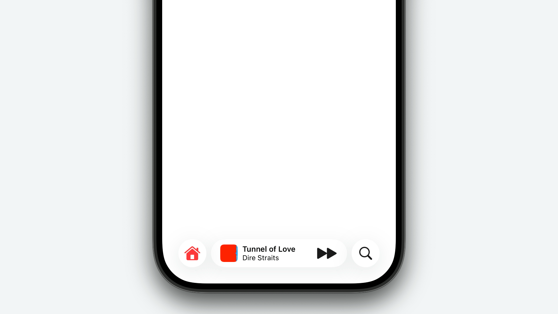
In iOS 26, UITabBarController has been updated with several new properties to support the new UITabAccessory. Perhaps most importantly is the new bottomAccessory property.
var bottomAccessory :UITabAccessory ? {get set }
Adding a bottom accessory is as simple as initialising an instance of the UITabAccessory class with a content view, and assigning it to this new bottomAccessory property.
let tabAccessory =UITabAccessory (contentView : contentView)
bottomAccessory = tabAccessory
Of course, this property is optional, so you can set the value to nil to remove the bottom accessory.
There's also a new setBottomAccessory(_:animated) method which allows you to add or remove a bottom accessory with a system-defined animation.
func setBottomAccessory (_ bottomAccessory:UITabAccessory ?, animated:Bool )
let tabAccessory =UITabAccessory (contentView : contentView)
setBottomAccessory (tabAccessory,animated :true )
UITabBarController has also received a new tabBarMinimizeBehavior property, of type UITabBarController.MinimizeBehavior.
var tabBarMinimizeBehavior :UITabBarController .MinimizeBehavior {get set }
This property controls whether or not the tab bar minimises into its compact appearance, and what triggers it to do so. Learn more about these enum cases further down the page.
tabBarMinimizeBehavior = .onScrollDown
Finally, on the tab bar controller front, a new property has been added to help determine the available space in the tab bar controller's view, accounting for the tab bar and tab accessory.
var contentLayoutGuide :UILayoutGuide {get }
In the example below, I've constrained a subview, with a background colour of UIColor.tertiarySystemFill, to the top, bottom, leading and trailing anchors of the content layout guide.
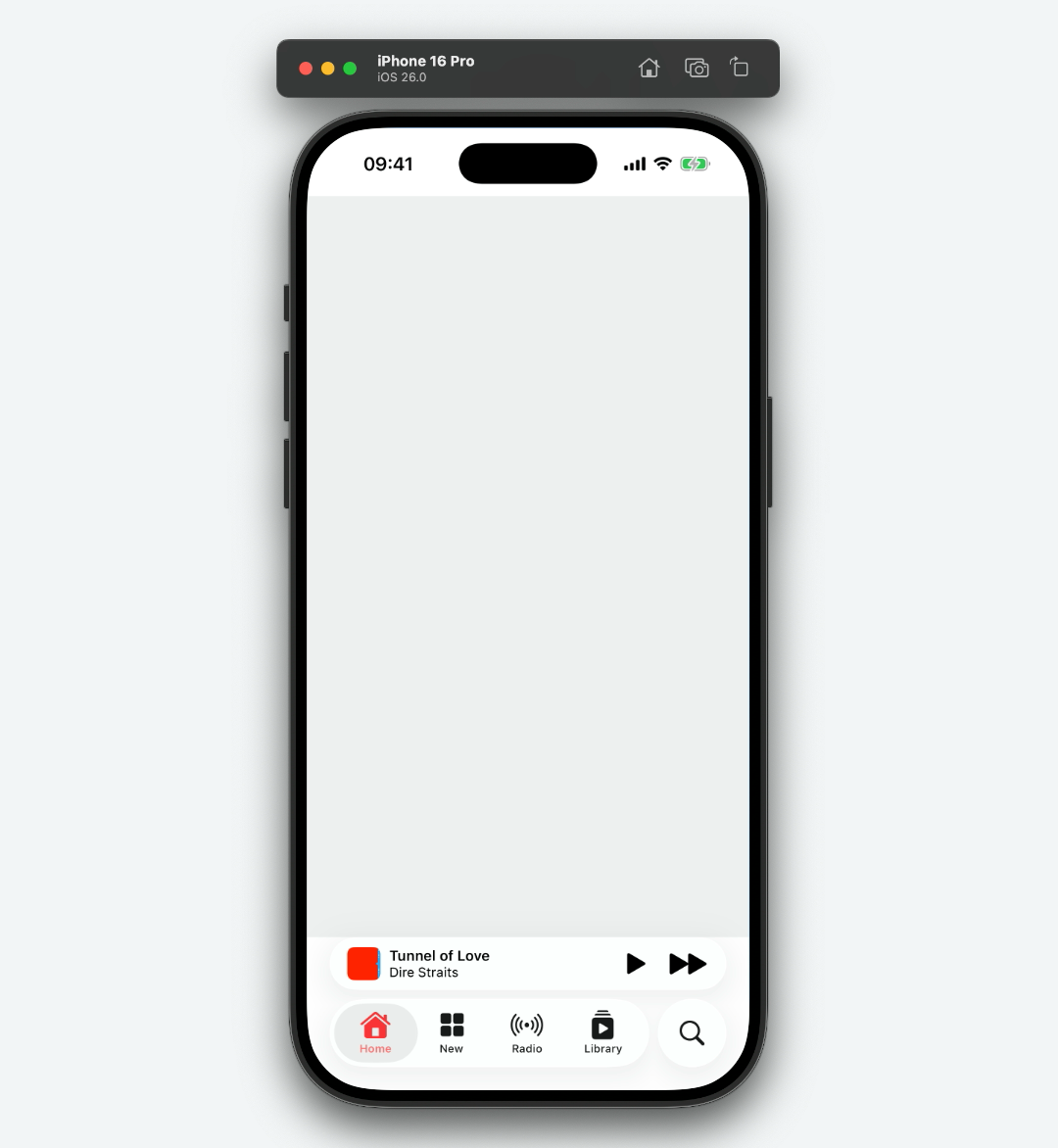
And, of course, this layout guide adapts as the tab bar collapses or expands, and as the accessory view is shown or hidden.
MinimizeBehavior
UITabBarController.MinimizeBehavior is a new enumeration that provides a set of cases describing how the new iOS 26 tab bar collapses.
extension UITabBarController {
enum MinimizeBehavior :Int {
case automatic =0
case never =1
case onScrollDown =2
case onScrollUp =3
}
}
Setting the value of a UITabBarController's tabBarMinimizeBehavior property to never will disable the behaviour entirely. Setting the value of this property to onScrollDown will collapse the tab bar when the user scrolls down, and will expand the tab bar when the user scrolls back up. Setting the value of this property to onScrollUp will do the opposite, which is recommended if a scroll view's content is aligned to the bottom. The default case, automatic, lets the system decide this behaviour.
UITabGroup 26.1
UITabGroup, one of the family of APIs that allow you to declaratively create tabs for your tab bar controller, has been updated in the iOS 26.1 SDK with a new isSidebarDestination property.
var isSidebarDestination :Bool {get set }
The default value is false, meaning the tab group is displayed only as a heading for its children. Tapping this heading simply expands and collapses the tab group. However, when true, the tab group can be selected, like any other tab, as a destination in the tab bar controller's sidebar.
let browserTabsGroup =UITabGroup (
title :"Tabs" ,
image :UIImage (systemName :"ipad" ),
identifier :"com.example.browser-tabs-group"
) { tab in return BrowserTabsViewController ()
}children : {
return [... ]
}
browserTabsGroup.isSidebarDestination =true
UITextFieldDelegate
UITextFieldDelegate has seen a couple of small updates to support Apple's new Natural Selection feature. Namely, two deprecations, and two new methods.
Firstly, textField(_:shouldChangeCharactersIn:replacementString:) has been deprecated in favour of a new, optional method, textField(_:shouldChangeCharactersInRanges:replacementString:).
optional func textField (_ textField:UITextField ,shouldChangeCharactersInRanges ranges: [NSValue ],replacementString string:String ) ->Bool
And, secondly, textField(_:editMenuForCharactersIn:suggestedActions:) has been deprecated in favour of another new, optional method, textField(_:editMenuForCharactersInRanges:suggestedActions:).
optional func textField (_ textField:UITextField ,editMenuForCharactersIn range:NSRange ,suggestedActions : [UIMenuElement ]) ->UIMenu ?
UITextInputTraits 26.1
New in the iOS 26.1 SDK is an update to the UITextInputTraits protocol — namely, the addition of the allowsNumberPadPopover property.
optional var allowsNumberPadPopover :Bool {get set }
When true, the system will display the keyboard as a number pad for text input views whose keyboardType is set to one of the numerical keyboard type constants defined on UIKeyboardType. These constants include numberPad, phonePad, decimalPad and asciiCapableNumberPad.
let textField =UITextField ()
textField.keyboardType = .numberPad
textField.allowsNumberPadPopover =true
Because this property is defined on UITextInputTraits, it's available on all classes conforming to that protocol, including UITextField and UITextView.
It's worth noting, this behaviour is exclusive to iPadOS.
UITextView
In iOS 26, UITextView has seen one small but pretty significant change. The selectedRange property has been deprecated, in favour of the new selectedRanges property.
var selectedRanges : [NSRange ] {get set }
This is to better support selecting text that contains a combination of left-to-right and right-to-left languages; a feature that Apple is calling Natural Selection.
For both left-to-right and right-to-left languages, the underlying text storage object stores characters in the order that they are written in. When displaying a left-to-right or right-to-left language in isolation, this isn't a problem. The issue arises when they are displayed together, in a single document, as the next character in the text storage sequence may not be the next character displayed on screen.
Historically, this has led to some pretty funky text selection behaviour. In iOS 26, the text selection experience is seamless, even when combining left-to-right and right-to-left languages.
In the video above, the final selection will result in an array of two NSRanges being returned from the selectedRanges property. The first with a location of 0 and length of 6, and the second with a location of 8 and length of 2.
UITextViewDelegate
Much like UITextFieldDelegate, UITextViewDelegate has seen a couple of deprecations and new methods to support Apple's new Natural Selection feature.
First up, textView(_:shouldChangeTextIn:replacementText:) has been deprecated in favour of the new, optional textView(_:shouldChangeTextInRanges:replacementText:) method.
optional func textView (_ textView:UITextView ,shouldChangeTextInRanges ranges: [NSValue ],replacementText text:String ) ->Bool
And textView(_:editMenuForTextIn:suggestedActions:) has been deprecated in favour of the new, optional textView(_:editMenuForTextInRanges:suggestedActions:) method too.
optional func textView (_ textView:UITextView ,editMenuForTextInRanges ranges: [NSValue ],suggestedActions : [UIMenuElement ]) ->UIMenu ?
UIToolbarAppearance
Much like UINavigationBarAppearance, UIToolbarAppearance has been updated to support the new bar button item style, prominent. The old doneButtonAppearance property has been deprecated, with a new prominentButtonAppearance property taking its place.
var prominentButtonAppearance :UIBarButtonItemAppearance {get set }
You can use this prominent button appearance proxy to customise the default look of your prominent toolbar items, across your app.
UITraitCollection
In iOS 26, UITraitCollection has been updated with several new properties to support new UIKit features.
First of all, a new property, tabAccessoryEnvironment. This will return one of the cases in the new UITabAccessory.Environment enumeration which you can use for determining layout information of a view participating in a tab accessory's view hierarchy.
var tabAccessoryEnvironment :UITabAccessory .Environment {get }
Secondly, another new property, splitViewControllerLayoutEnvironment. This will return one of the cases from the new UISplitViewController.LayoutEnvironment which you can use to determine if an ancestor split view controller is in its expanded or collapsed state.
var splitViewControllerLayoutEnvironment :UISplitViewController .LayoutEnvironment {get }
In the example below, a UICollectionViewCell subclass queries this trait to conditionally show a disclosure indicator. If the split view controller is in its expanded state, the disclosure indicator is hidden...
...and if the split view controller is in its collapsed state, the disclosure indicator is shown...
As of iOS 18, UIImageViews displaying an HDR image would intelligently fall back to SDR to ensure that the focused content of your app stands out. One such example of this is when a view controller displaying an HDR image presents another view controller.
In iOS 26, developers can add support for this to their custom components using the new hdrHeadroomUsageLimit property, which will return a case from the new UIHDRHeadroomUsageLimit enumeration.
var hdrHeadroomUsageLimit :UIHDRHeadroomUsageLimit {get }
Finally, resolvesNaturalAlignmentWithBaseWritingDirection. This property will return a Boolean value indicating whether or not text in a given language should be displayed in its native writing direction, or instead follow the writing direction of the user's default language.
var resolvesNaturalAlignmentWithBaseWritingDirection :Bool {get }
For example, if the value of this property is true and the user's default language is English (a left to right language), text written in Arabic (a right to left language) will be displayed from right to left. If this property is set to false, the Arabic text will be displayed from left to right.
traitOverrides .resolvesNaturalAlignmentWithBaseWritingDirection =true
traitOverrides .resolvesNaturalAlignmentWithBaseWritingDirection =false
New initialisers of UITraitCollection have also been added to construct trait collections with the desired values of these new properties.
init (hdrHeadroomUsageLimit :UIHDRHeadroomUsageLimit )
init (tabAccessoryEnvironment :UITabAccessory .Environment )
convenience init (resolvesNaturalAlignmentWithBaseWritingDirection :Bool )
UITraitHDRHeadroomUsageLimit
UITraitHDRHeadroomUsageLimit is a new structure conforming to the UITraitDefinition protocol that's been added to support UITraitCollection's trait observation APIs.
struct UITraitHDRHeadroomUsageLimit :UITraitDefinition {
static let defaultValue :UIHDRHeadroomUsageLimit
static let name :String
static let identifier :String
static let affectsColorAppearance :Bool
}
Its associated type is the new UIHDRHeadroomUsageLimit enumeration.
You can use this type alongside APIs such as registerForTraitChanges(_:handler:) to observe change to the HDR headroom usage limit.
registerForTraitChanges ([UITraitHDRHeadroomUsageLimit .self ]) { (traitEnvironment:Self , previousTraitCollection:UITraitCollection )in
let limit = traitEnvironment.traitCollection .hdrHeadroomUsageLimit
}
To learn more, check out UITraitCollection's new hdrHeadroomUsageLimit property.
UITraitResolvesNaturalAlignmentWithBaseWritingDirection
Take a deep breath! UITraitResolvesNaturalAlignmentWithBaseWritingDirection is a new structure conforming to the UITraitDefinition protocol that's also been added to support UITraitCollection's trait observation APIs.
struct UITraitResolvesNaturalAlignmentWithBaseWritingDirection :UITraitDefinition {
static let defaultValue :Bool ?
static let name :String
static let identifier :String
static let affectsColorAppearance :Bool
}
You can also use this type alongside trait registration APIs like registerForTraitChanges(_:handler:). To learn more about what this does, check out UITraitCollection's new resolvesNaturalAlignmentWithBaseWritingDirection property.
UITraitSplitViewControllerLayoutEnvironment
UITraitSplitViewControllerLayoutEnvironment is another new structure conforming to the UITraitDefinition protocol, also added to support UITraitCollection's trait observation APIs.
struct UITraitSplitViewControllerLayoutEnvironment :UITraitDefinition {
static let defaultValue :UISplitViewController .LayoutEnvironment
static let name :String
static let identifier :String
static let affectsColorAppearance :Bool
}
Like the trait definitions listed above, you can use this with the all the trait registration APIs. And to learn more, check out the associated type, UISplitViewController.LayoutEnvironment.
UITraitTabAccessoryEnvironment
The last new trait definition in the iOS 26 SDK is UITraitTabAccessoryEnvironment. Like all of the above, this is a simple structure conforming to the UITraitDefinition protocol, added to support trait observation APIs.
struct UITraitTabAccessoryEnvironment :UITraitDefinition {
static let defaultValue :UITabAccessory .Environment
static let name :String
static let identifier :String
static let affectsColorAppearance :Bool
}
Have a read of the updates to UITabAccessory and UITabAccessory.Environment to learn more!
UIView
In iOS 26, Apple have added support for the Swift-based Observation framework's Observable objects. UIKit automatically tracks references to Observable objects in methods like layoutSubviews(), determines which properties of the Observable that the method relies on, and, when those properties change, reruns the appropriate method.
@Observable class ObservableModel {
var isLoading :Bool =false
}
class ObservableView :UIView {
var model :ObservableModel
var label :UILabel
override func layoutSubviews () {
super .layoutSubviews ()
label .text =model .isLoading ?"Loading" :"Done"
}
}
In the example above, when the model's isLoading property changes, layoutSubviews() will be called automatically and label's text property will be updated.
However, you might not want your layoutSubviews() code to be rerun when some state in an Observable object changes as it may contain some computationally expensive layout code. Apple's solution to this is a new method of UIView, updateProperties().
func updateProperties ()
This method, which fully supports observation tracking, runs before layoutSubviews() and should be used to populate content or apply styling to your views.
Like other lifecycle methods, you can trigger it manually with the new setNeedsUpdateProperties() method, although it's worth noting that multiple calls may be coalesced into a single update during the next layout pass.
func setNeedsUpdateProperties ()
To force an immediate properties update, call the new updatePropertiesIfNeeded() method. This will invalidate this view, including any descendant subviews.
func updatePropertiesIfNeeded ()
UIView has also received a few new methods that work in conjunction with its new LayoutRegion API - a struct that describes an area of a view, with optional horizontal or vertical insets to account for corner curvature or window controls.
First of all, layoutGuide(for:). This method will return an instance of UILayoutGuide for the given layout region. Perfect for use with Auto Layout constraints.
func layoutGuide (for region:UIView .LayoutRegion ) ->UILayoutGuide
Up next, edgeInsets(for:), which will return UIEdgeInsets for the given layout region. You can, of course, use these insets with manual layout code, or even set a scroll view's contentInset property, without insetting the frame of the scroll view itself.
func edgeInsets (for region:UIView .LayoutRegion ) ->UIEdgeInsets
And, finally, directionalEdgeInsets(for:). This will return an instance of NSDirectionalEdgeInsets for the desired layout region.
func directionalEdgeInsets (for region:UIView .LayoutRegion ) ->NSDirectionalEdgeInsets
For an example of UIView.LayoutRegion in action, read on...
This year, the UIKit team have added an all-new way of configuring a view's corner radii with the new cornerConfiguration property!
var cornerConfiguration :UICornerConfiguration {get set }
These corner configurations allow you to set uniform, independent, and container-concentric corner radii incredibly easily!
let rectangleView =UIView ()
rectangleView.backgroundColor = .systemBlue
rectangleView.cornerConfiguration = .uniformEdges (topRadius :52 ,bottomRadius :26 )
This API is incredibly versatile and has been integrated with system components such as sheets, popovers and even window scenes! Check out UICornerConfiguration and UICornerRadius to learn more!
To support this, a nice new convenience method has been added to UIView, effectiveRadius(corner:).
func effectiveRadius (corner :UIRectCorner ) ->CGFloat
When called, this method will return the radius of the specified corner, as a CGFloat, based on the view's current corner configuration.
let radius = rectangleView.effectiveRadius (corner : .topLeft )
// 52
AnimationOptions
UIView's AnimationOptions option set has received a new option, flushUpdates.
static var flushUpdates :UIView .AnimationOptions {get }
When using this new animation option, UIKit applies any pending trait, property, or layout changes before entering and exiting an animation context.
What does this mean in practicality? You no longer have to call layoutIfNeeded() inside a UIView.animate(withDuration:animations:completion:) block when animating changes to constraints, for example.
UIView .animate (withDuration :1 ) {
heightConstraint .constant =100
layoutIfNeeded ()
}
UIView .animate (withDuration :1 ,options : .flushUpdates ) {
heightConstraint .constant =100
}
LayoutRegion
UIView's new LayoutRegion API is a structure that describes an area of a view, like the safe area, but with features like corner curve avoidance built in.
You don't initialise an instance of this struct directly. Instead, use one of the predefined several static methods.
extension UIView {
struct LayoutRegion :Hashable ,Equatable {
static func safeArea (cornerAdaptation :UIView .LayoutRegion .AdaptivityAxis ? =nil ) ->UIView .LayoutRegion
static func margins (cornerAdaptation :UIView .LayoutRegion .AdaptivityAxis ? =nil ) ->UIView .LayoutRegion
static func readableContent (cornerAdaptation :UIView .LayoutRegion .AdaptivityAxis ? =nil ) ->UIView .LayoutRegion
}
}
The above will return a layout region representing the safe area, layout margins, or readable content guide, respectively.
Each static method accepts a case from the new UIView.LayoutRegion.AdaptivityAxis enumeration as an argument. This will return a layout region avoiding corner curves by insetting the region from the horizontal or vertical edge if needed.
You can use the return value of these functions to request a layout guide, edge insets, or directional edge insets for the given layout region using UIView's new layoutMargins(for:), edgeInsets(for:) or directionalEdgeInsets(for:) methods, respectively.
In the example below, a layout guide is requested with a vertical corner adaptation to avoid the new window controls on iPadOS.
let label =UILabel ()
label.text ="Hello, World!"
label.font = .preferredFont (forTextStyle : .extraLargeTitle )
label.translatesAutoresizingMaskIntoConstraints =false
view .addSubview (label)
let contentGuide =view .layoutGuide (
for : .margins (cornerAdaptation : .vertical )
)
NSLayoutConstraint .activate ([
label.topAnchor .constraint (equalTo : contentGuide.topAnchor ),
label.leadingAnchor .constraint (equalTo : contentGuide.leadingAnchor )
])
AdaptivityAxis
UIView.LayoutRegion.AdaptivityAxis is new enumeration that's been added to support the new UIView.LayoutRegion structure.
Specifically, it provides two cases that can be passed into LayoutRegion's static safeArea(cornerAdaptation:), margins(cornerAdaptation:) and readableContent(cornerAdaptation:) methods.
extension UIView .LayoutRegion {
enum AdaptivityAxis :Equatable {
case horizontal
case vertical
}
}
While similar in purpose to UIAxis, this is not an OptionSet which means you can only request a layout guide, etc., for a single axis at a time. Perhaps the UIKit team don't foresee the need for insetting content both vertically and horizontally with corner adaptations at the same time?
UIViewController
In iOS 26, UIViewController has also been updated with first class support for observation tracking. Methods such as viewWillLayoutSubviews(), viewDidLayoutSubviews() and updateViewConstraints() all support automatic observation tracking.
Much like UIView, there are three new methods supporting observation tracking outside of layout lifecycle methods: updateProperties(), setNeedsUpdateProperties() and updatePropertiesIfNeeded().
func updateProperties ()
func setNeedsUpdateProperties ()
func updatePropertiesIfNeeded ()
Also new in iOS 26 is UIViewController's new prefersInterfaceOrientationLocked property.
var prefersInterfaceOrientationLocked :Bool {get }
This differs from the existing supportedInterfaceOrientations property as your view controller's interface may be agnostic to interface orientation, supporting both portrait and landscape, but may want to lock the orientation to whatever the current interface orientation is.
One such example of this is a driving game with tilt controls, which may be playable in both portrait and landscape. When the user starts the game, it would make sense to temporarily lock the scene's orientation to prevent unwanted changes caused by the user rotating their devices to steer.
This property is read-only, so you'll have to override it in your UIViewController subclass. To alert the system of any changes made to the underlying value of this property, call the new setNeedsUpdateOfPrefersInterfaceOrientationLocked() method.
func setNeedsUpdateOfPrefersInterfaceOrientationLocked ()
Container view controllers, such as UINavigationController or UITabBarController, can specify a child view controller from which the prefersInterfaceOrientationLocked property should be derived.
class NavigationController :UINavigationController {
override var childViewControllerForInterfaceOrientationLock :UIViewController ? {
return topViewController
}
}
You can query the current state of the interface orientation lock through UIWindowScene.Geometry's new isInterfaceOrientationLocked property.
Transition
In iOS 18, Apple added a new zoom transition API, accessible through a new property of UIViewController, preferredTransition. This property accepts an instance of a new type, UIViewController.Transition. This new type introduced a number of transitions; most notably, zoom(options:sourceViewProvider:).
This year, Apple have refined this API with a new zoom(options:sourceBarButtonItemProvider:) method that allows you to return an instance of UIBarButtonItem in the trailing closure, instead of a UIView.
let viewController =DetailViewController ()
viewController.preferredTransition = .zoom { contextin
return navigationItem .rightBarButtonItem
}
present (viewController,animated :true )
UIViewPropertyAnimator
Much like UIView.AnimationOptions, UIViewPropertyAnimators now supporting applying pending updates to traits, properties, and layout before entering or exiting an animation context.
This is an opt-in behaviour with a new property of UIViewPropertyAnimator, flushUpdates.
var flushUpdates :Bool {get set }
As per UIView.AnimationOptions, this essentially means you no longer have to call layoutIfNeeded() in your animation block.
let animator =UIViewPropertyAnimator (duration :1 ,curve : .easeInOut )
animator.flushUpdates =true
animator.addAnimations {
heightConstraint .constant =100
}
animator.startAnimation ()
The default value is false.
UIWindowScene
There's not much to note about UIWindowScene itself in iOS 26, just a couple of deprecations. The coordinateSpace and interfaceOrientation properties have been deprecated, in favour of properties of the same names in the window scene's effectiveGeometry object.
Geometry
As mentioned above, UIWindowScene's coordinateSpace and interfaceOrientation properties have been deprecated. Their functionality, however, lives on in the form of two properties of UIWindowScene.Geometry, under the same names.
Added in iOS 26, coordinateSpace, and added in iOS 16, interfaceOrientation.
var coordinateSpace :any UICoordinateSpace {get }
var interfaceOrientation :UIInterfaceOrientation {get }
UIWindowScene's Geometry object has also seen the addition of a new isInterfaceOrientationLocked property, supporting the new property added to UIViewController, prefersInterfaceOrientationLocked. This property will tell you if any visible view controller in the relevant scene has requested the interface orientation be locked to the current state.
var isInterfaceOrientationLocked :Bool {get }
The final addition to UIWindowScene.Geometry is the new isInteractivelyResizing property.
var isInteractivelyResizing :Bool {get }
This property will return true if the window scene is being resized by the user in iPadOS' new windowing system. You might use the result of this property to defer any particularly graphically-intensive work until the user has finished interactively resizing the window.
UIWindowSceneDelegate
The UIWindowSceneDelegate protocol has been updated with a couple of new, optional methods to support iPadOS' new windowing system. Firstly, windowScene(_:didUpdateEffectiveGeometry:).
optional func windowScene (_ windowScene:UIWindowScene ,didUpdateEffectiveGeometry previousEffectiveGeometry:UIWindowScene .Geometry )
This method is called by the system whenever the frame, coordinate space or interface orientation of a scene changes. It will also be called when a view controller's preference for an interface orientation lock changes.
Secondly, preferredWindowingControlStyle(for:).
optional func preferredWindowingControlStyle (for windowScene:UIWindowScene ) ->UIWindowScene .WindowingControlStyle
This method is called by the system to determine the style of the horizontal traffic light window controls. As of now, there are three styles: automatic, minimal and unified, accessible as class variables of UIWindowScene.WindowingControlStyle.
extension UIWindowScene {
class WindowingControlStyle :NSObject {
class var automatic :UIWindowScene .WindowingControlStyle {get }
class var minimal :UIWindowScene .WindowingControlStyle {get }
class var unified :UIWindowScene .WindowingControlStyle {get }
}
}
The automatic style will default to the system's preferred style which, at the time of writing, is unified. Below, you can see the subtle difference between the unified and minimal control styles.
UIWritingToolsCoordinator
The UIWritingToolsCoordinator class has been updated with a new property, includesTextListMarkers.
var includesTextListMarkers :Bool {get set }
Put simply, this controls whether or not the result of a writing tools operation includes prefixes, such as bullets or numbers, alongside list items.
In the example below, on the left, the writing tools coordinator's includesTextListMarkers property is set to false by default. On the right, the property is set to true - note the duplicated list markers.
You might want to set this property to true if you're still using TextKit, which expects list markers in the contents of an NSAttributedString for paragraphs associated with an NSTextList, versus TextKit 2, which does not.
UIWritingToolsResultOptions
The UIWritingToolsResultOptions option set has received a new presentationIntent option.
static var presentationIntent :UIWritingToolsResultOptions {get }
Prior to iOS 26, the writing tools result options allowed you to specify an output containing plain text, rich text, lists, tables, or any combination of the aforementioned formats. These are great, but offer limited scope for customisation, returning attributed strings with concrete stylistic formatting like font sizes.
The new presentationIntent option serves to eliminate this limitation. So, in the case of a section header, rather than Writings Tools returning an attributed string with attributes of a fixed font size and weight...
let attributes: [NSAttributedString .Key :Any ] = [
.font :UIFont .systemFont (ofSize :24 ,weight : .semibold )
]
...it will return an attributed string with presentation intent attributes for you to render as you wish...
let attributes: [NSAttributedString .Key :Any ] = [
.presentationIntent :PresentationIntent (.header (level :1 ),identity :1 )
]
And that's all! Not just on the UIWritingToolsResultOptions front, but for UIKit 26 altogether. I think you'll agree it's been a pretty big year for this soon to be deprecated framework!
If you've made it this far, thank you for reading! This article was a real labour of love, the culmination of many weeks worth of work alongside my full-time job. As a result, I've been coerced into adding a Buy Me a Coffee link so if you enjoyed this article feel free to do that. If you didn't enjoy this article, shout at me on Twitter!
Until next time...